Chicago Pet Rescue Website Redesign
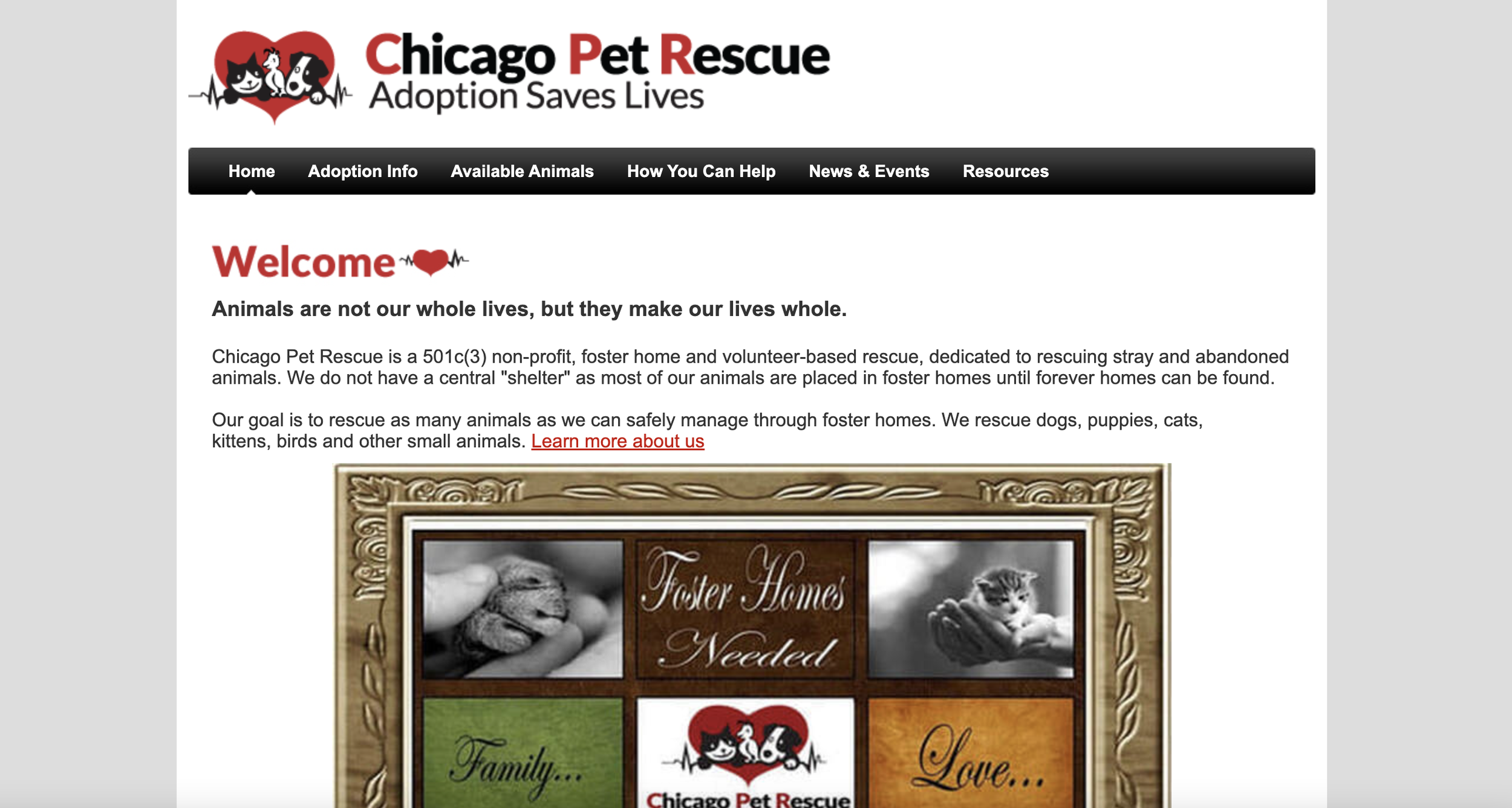
Chicago Pet Rescue is a non-profit, foster home, and volunteer-based rescue, dedicated to rescuing stray and abandoned animals. Their goal is to rescue as many animals as they can safely manage through foster homes. They rescue dogs, puppies, cats, kittens, birds, and other small animals.

TIMELINE
3 Weeks
MY ROLE
Research, UX/UI Design, Code
TEAMAshlie, Bea, Valerie
TOOLS
Figma, Figjam, InVision, GitHub, VS Code, Gantt Chart, Canva, PhotoShop, Google Docs
OVERVIEW
With so many animals in need of care and resources, and people looking for company and connection, often animal lovers feel more motivated to adopt a pet instead of purchasing one. When navigating a pet rescue website, in order to feel motivated to engage in the adoption process, the user needs to have trust in the organization and feel comfortable and satisfied with the amount of information they find. We identified a gap between what the visitors of the site expected and what the website provided. We were able to rethink ways to help the organization’s website serve a bigger purpose and for pet lovers to give back in a manner that provides value to all parties involved.
THE PROBLEM
The Chicago Pet Rescue website was cluttered and in need of updating. The site needed to focus on adoption as its main goal and encourage more foot traffic.
DESIGN CHALLENGE
How might we create an experience that provides the right amount of information to answer the user’s questions, builds trust, reduces abandonment, and encourages the completion of the pet adoption process?
THE SOLUTION
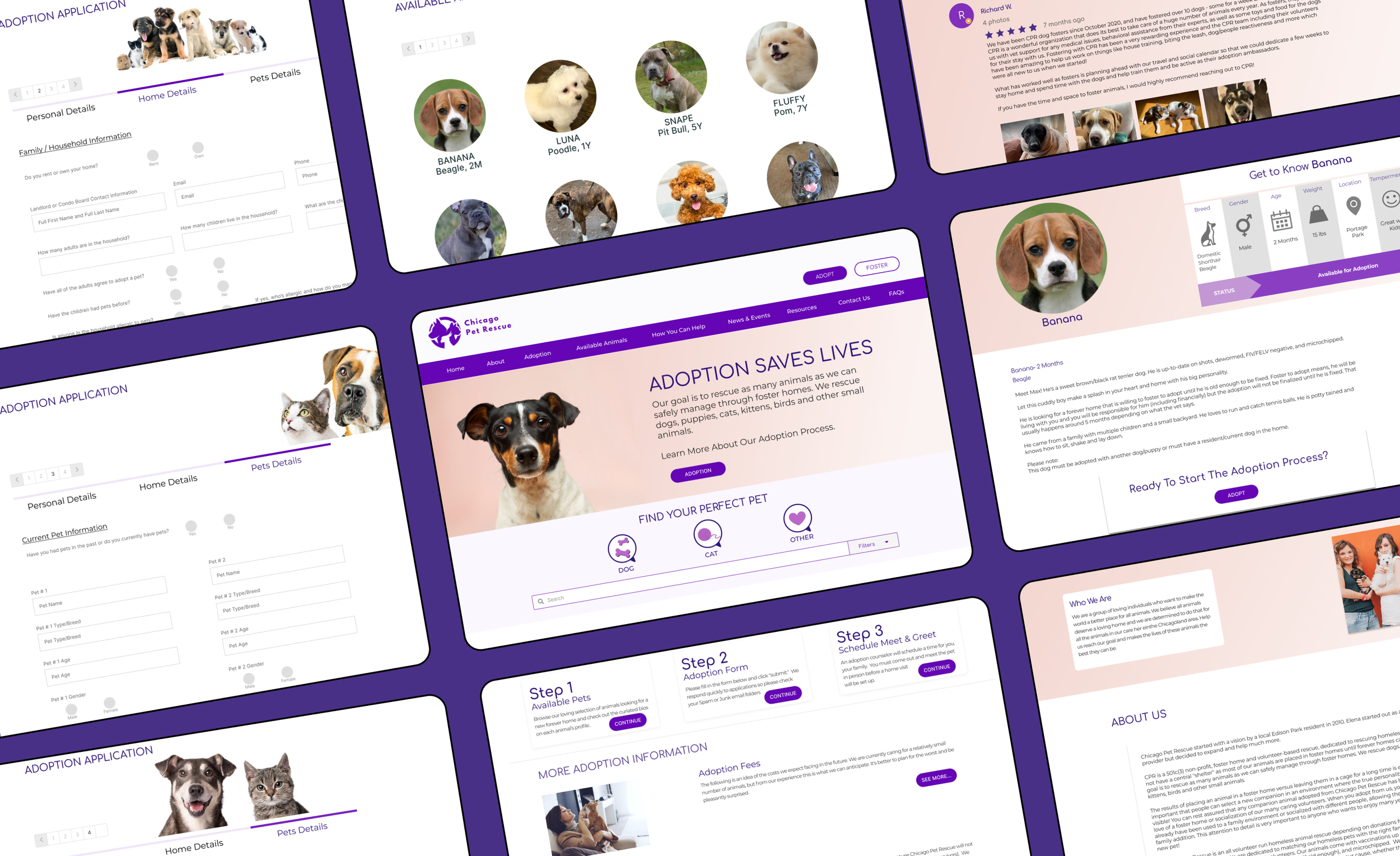
To create a streamlined and visually appealing site that clearly explains the adoption process and is easier to navigate. Apply modern UI elements, simplify the application form, and re-organize the navigation to enhance the usability and aesthetics of the Chicago Pet Rescue website while maintaining most of the original site composition and content integrity.
-
PROJECT SCOPE & TIMELINE
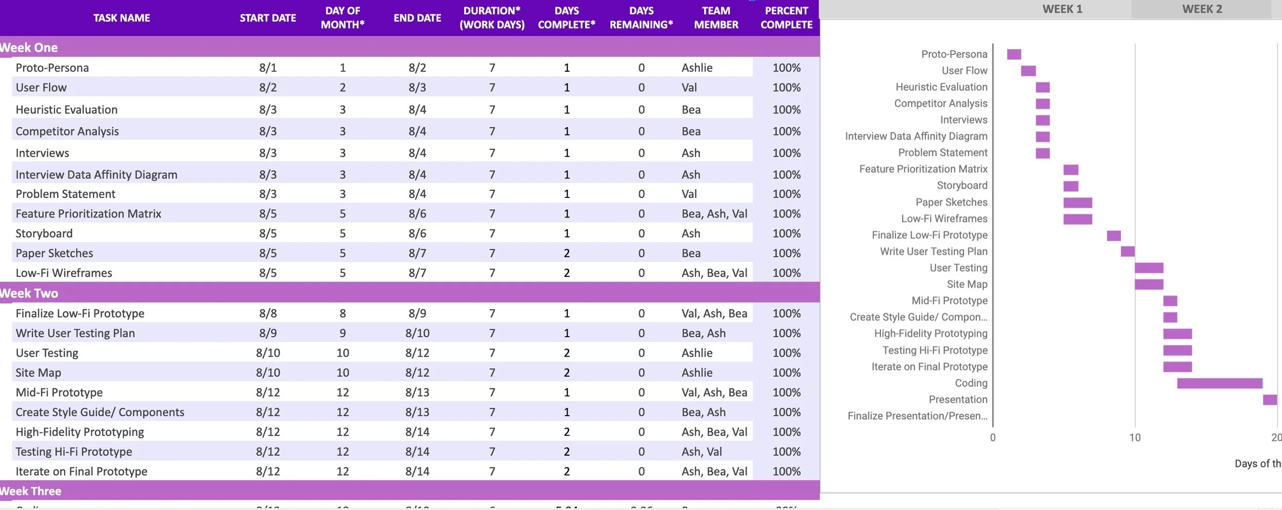
Time was a big constraint as the project needed to move fast. The team created a clear project scope and timeline at the outset of the project to ensure the efficient and effective investment of our time and effort.
-
RESEARCH PLAN
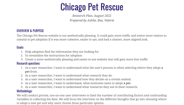
The research plan served as a base to set expectations and clear communication. We outlined the research objectives, goals, methods, and logistical needed for the case study.

EMPATHIZING WITH THE USER
-
STORY LINE
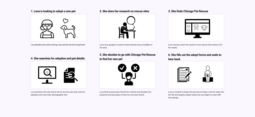
-
USER PERSONA

-
USER INTERVIEWS
We conducted user interviews to identify the challenges that pet rescuers faced when navigating the site as well as potential solutions to alleviate these pain points.
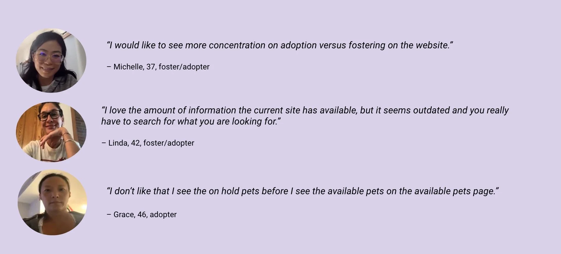
-
AFFINITY DIAGRAM
The interview data was organized into an Affinity Diagram which helped us sort and prioritize answers based on recurring themes and categories outlined by the team.
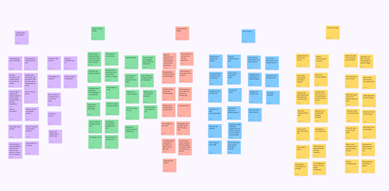
-
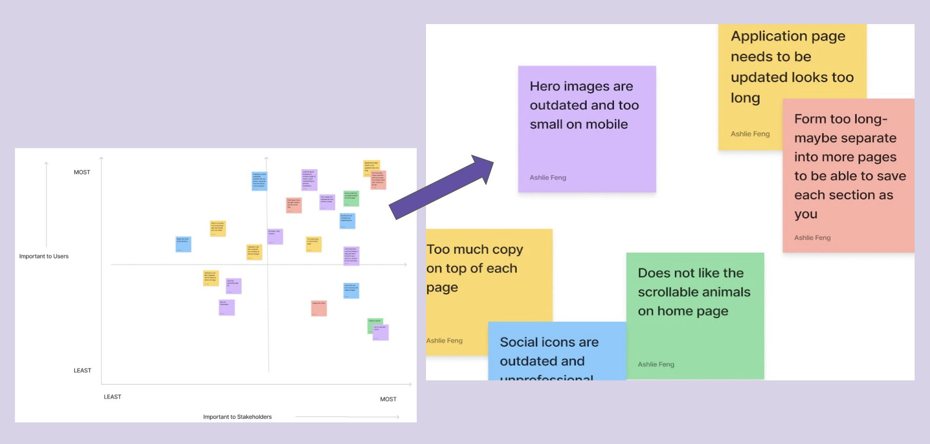
PRIORITIZATION MATRIX
Using users insights as our starting point, we used a prioritization matrix to highlight the user’s most relevant needs and the goals of the project. Each insight inspired multiple ideas that the team was able to collectively review and run through.
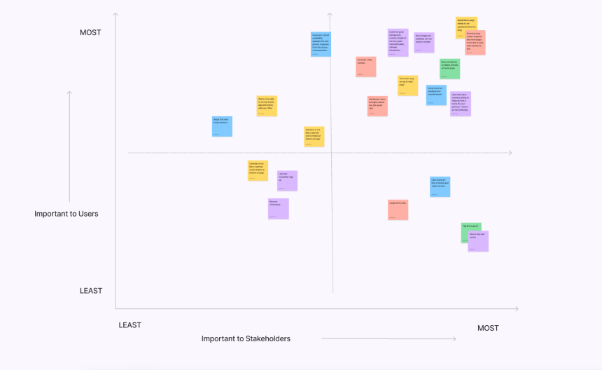
-
PROJECT FOCUS
The group then voted on answers we felt offered the greatest potential for viable solutions. These acted as our navigational compass through design and feature decisions.

DEFINING THE PROBLEM
-
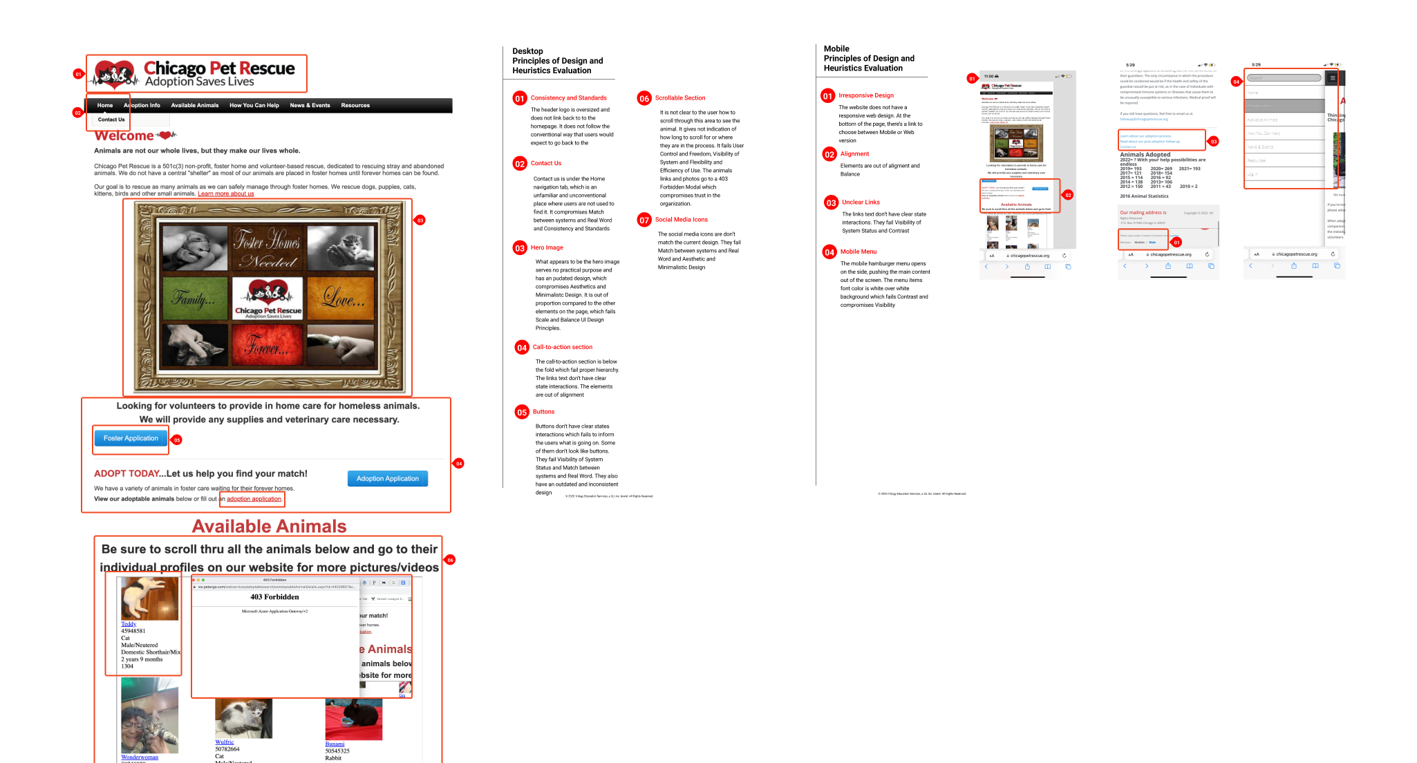
HEAURISTICS EVALUATION
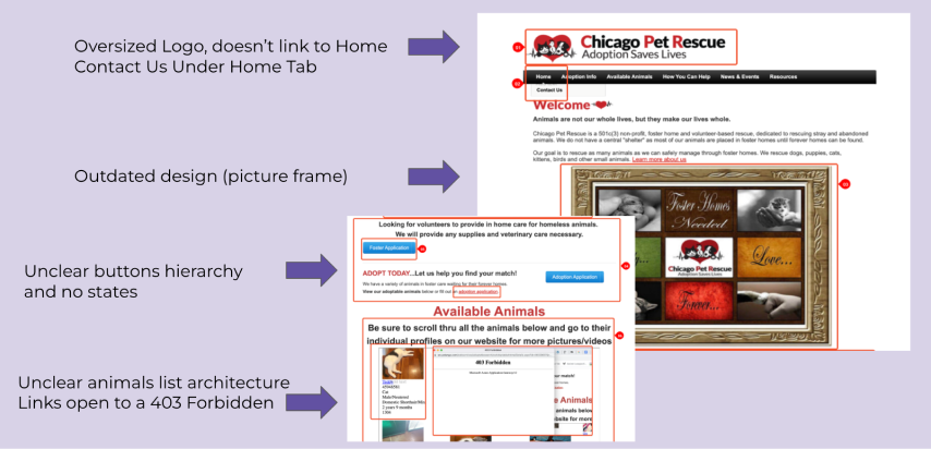
We evaluated the site for its use of heuristics and UI practices and identified major weaknesses that needed to be addressed.
-
HIGHLIGHTED PROBLEMS
-
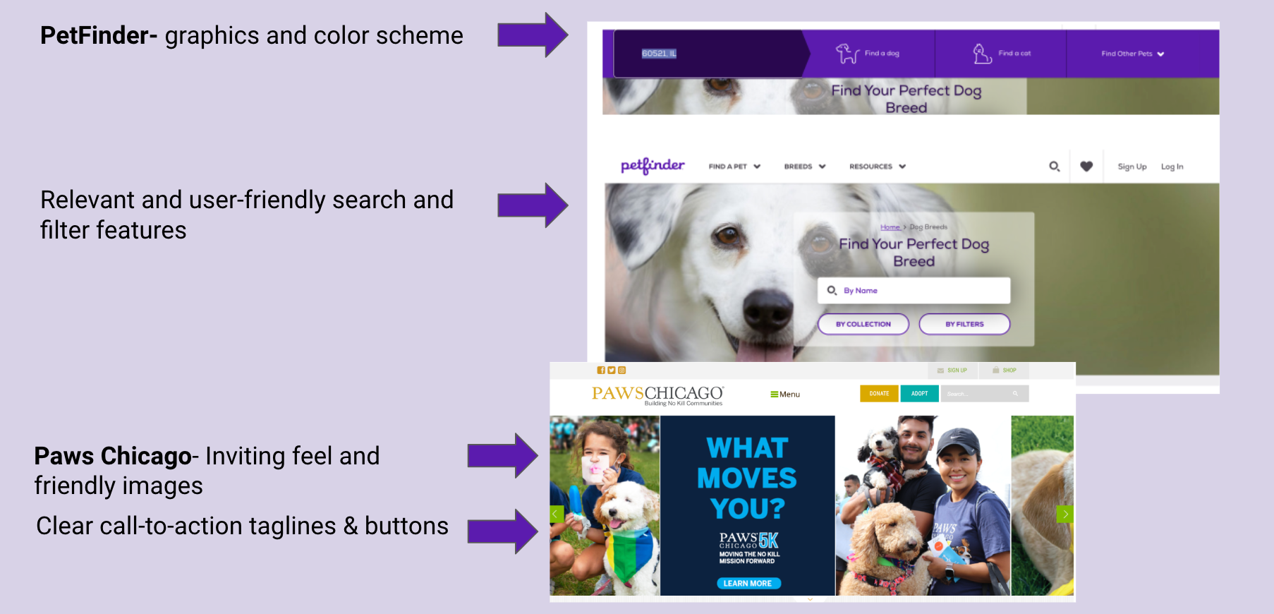
COMPETITIVE ANALYSIS
We gathered content that was used to inspire and inform our solution and lead us to originality.

-
HIGHLIGHTED IDEAS

IDEATION PHASE
-
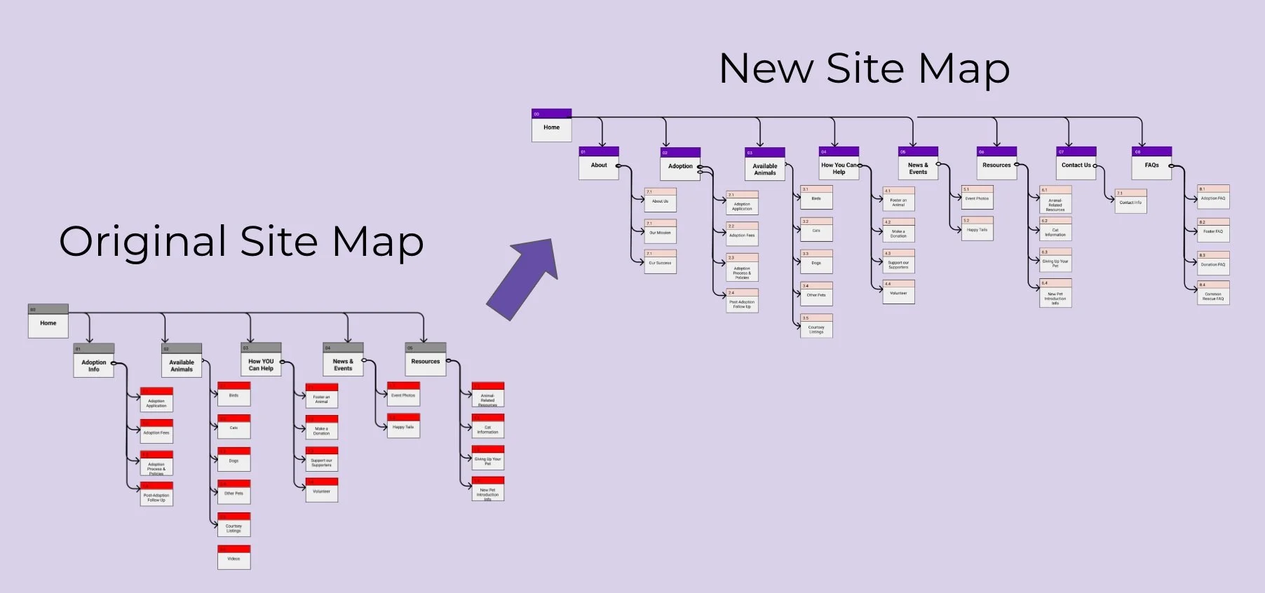
CARD SORTING AND SITEMAP
We went through the process of card sorting to start giving form to our ideas and solutions.
-
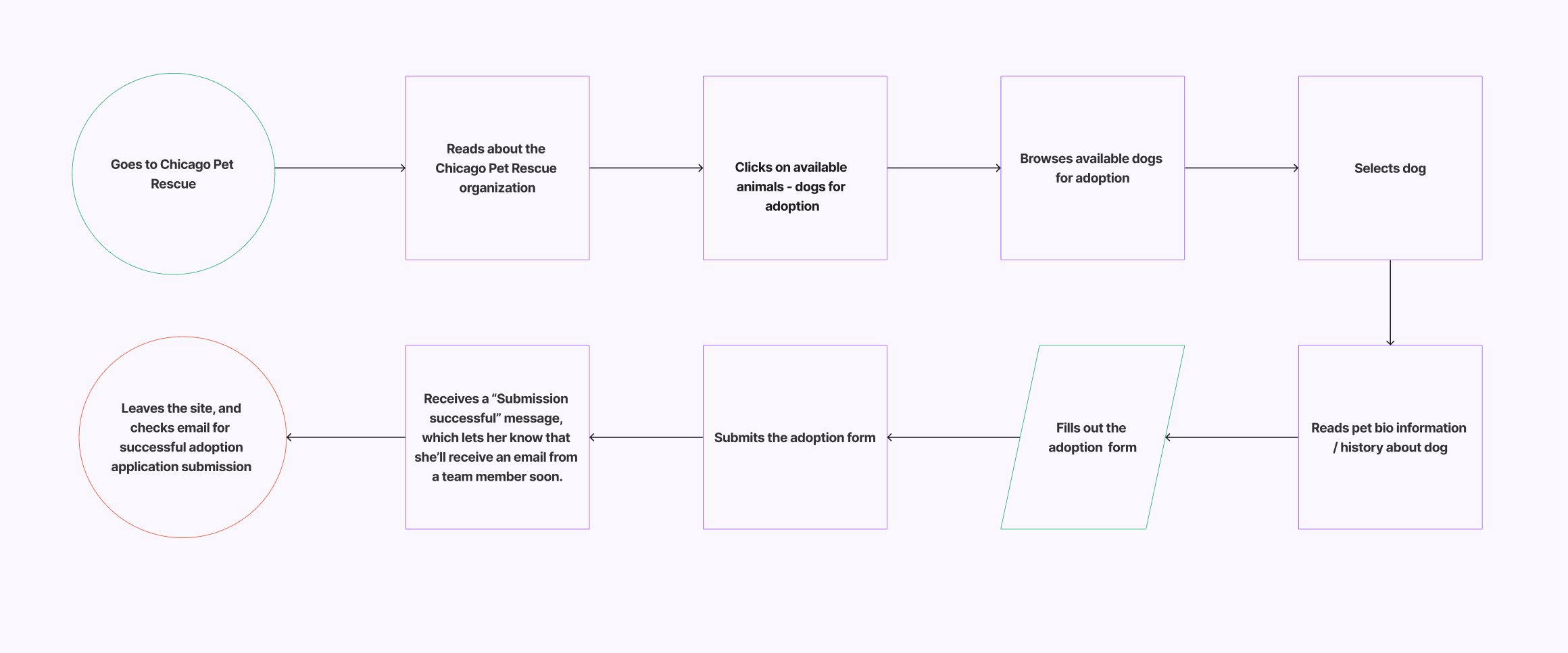
USER FLOW
We mapped out the user experience to identify the users steps and determine the design requirements to meet the users needs.
-
PROPOSED CHANGES BASED ON USER’S FEEDBACK AND WEBSITE EVALUATION:
Create a separate tab in the navigation for contact us
Move Adoption buttons before Foster buttons
Design a new/responsive hero image
Add Step-by-step adoption process
Add pet-finder/filter feature (by Pet Type/Breed/Proximity)
Organize/redesign pets scrollable section
-
Reduce overall website copy
Add a proper footer button
Redesign buttons with state interactions
Update social media icons
Reduce application form length and divide into separate pages with a progress bar

PROTOTYPE
-
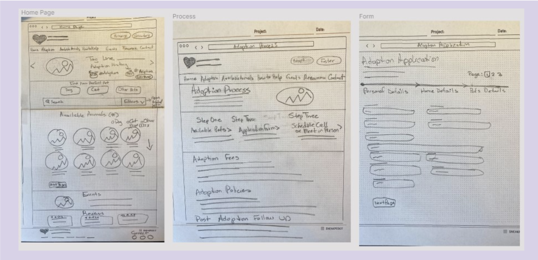
PAPER SKETCHES
With the initial concept in mind, we quickly generated sketches for possible solutions.
-
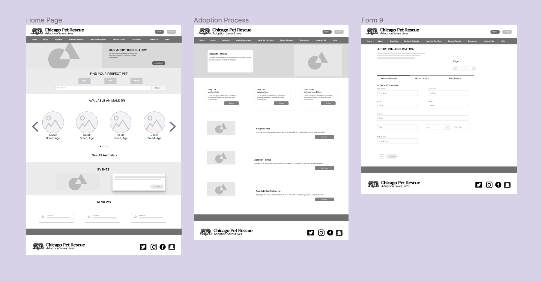
LOW-FIDELITY WIREFRAMES
The concept was translated into a few simple wireframes with a low-degree of complexity
-
REDESIGNING BRAND IDENTITY
The new logo design was based on more contemporary look of a combination of the three kind of animals from the original logo.

-
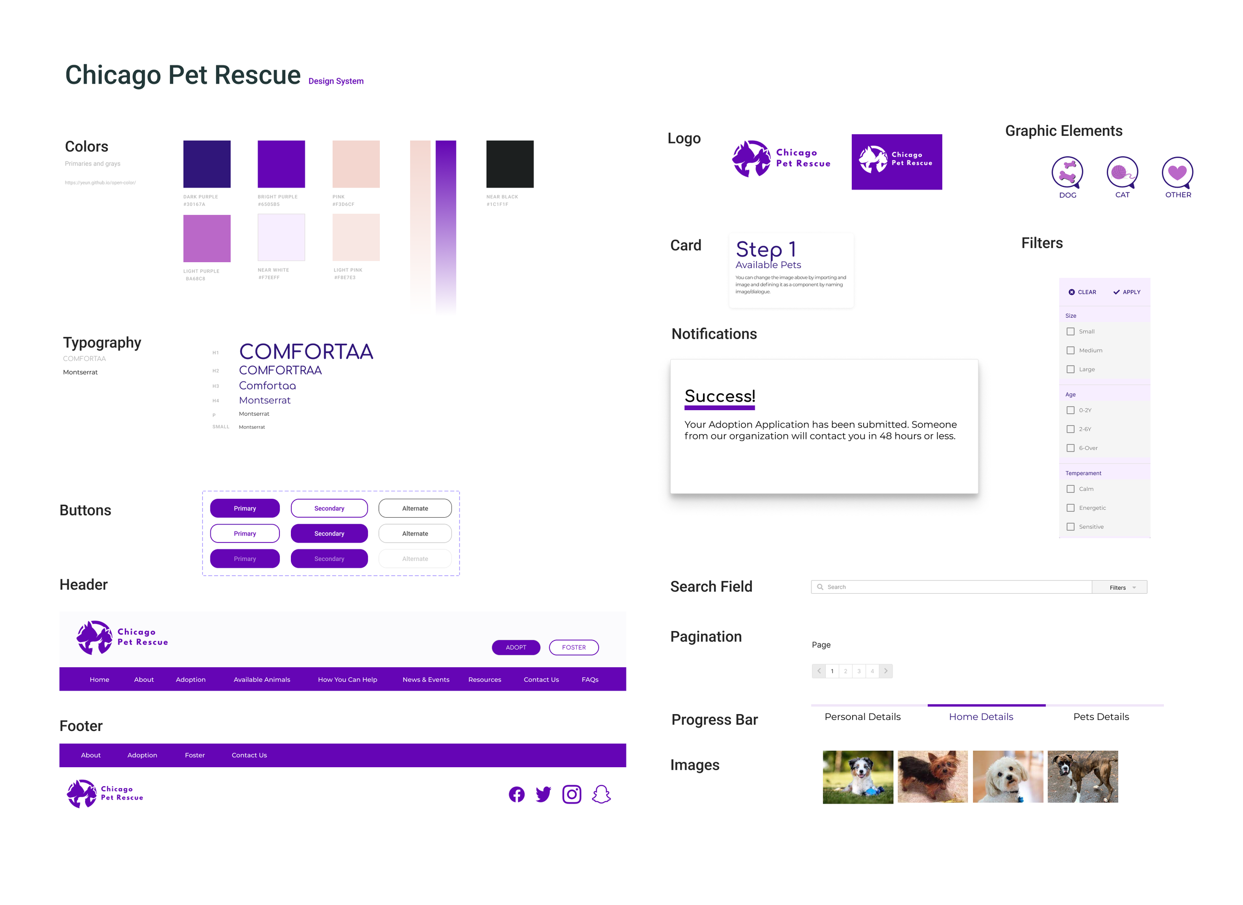
UI STYLE GUIDE
-
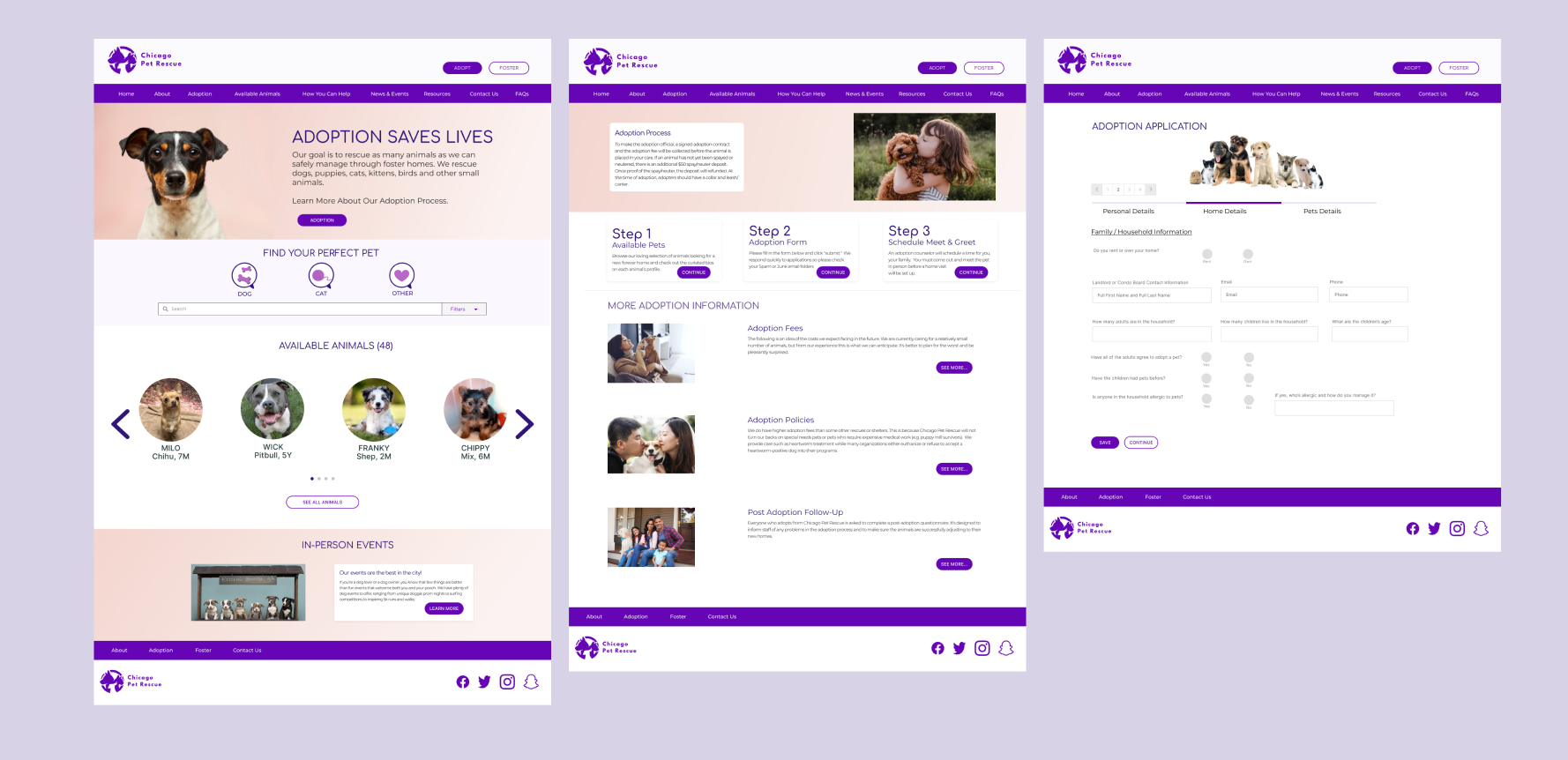
HIGH-FIDELITY PROTOTYPE
A style guide was defined to apply an original brand style to a more robust prototypes.
-
CLICKABLE PROTOTYPE WITH REUSABLE COMPONENTS
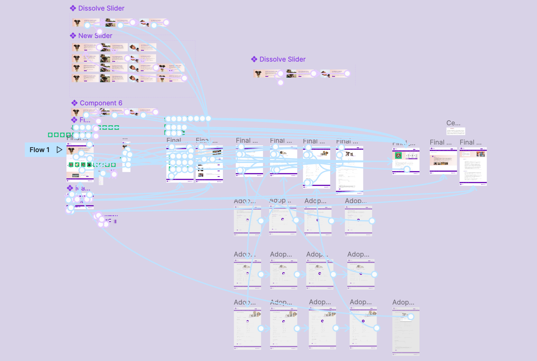
CHECK IT OUT!

TESTING
-
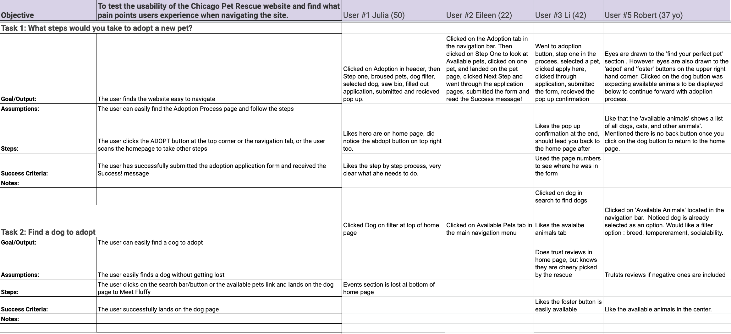
TESTING INTERVIEW DATA
-
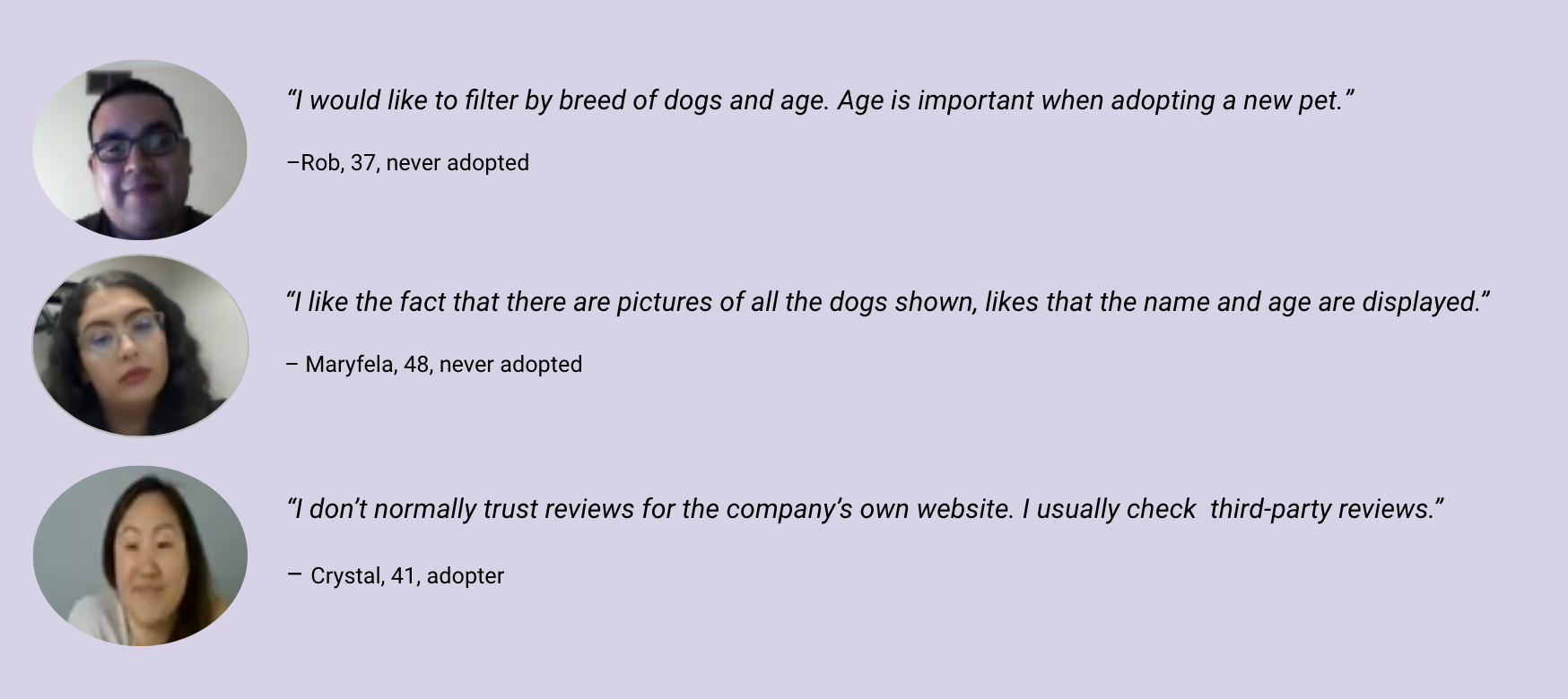
USER INTERVIEW COMMENTS
-
USER SUGGESTED CHANGES
Next Step button(Bio) should lead to adoption form, not adoption process
Show the number of animals availablE
Add temperament section to bio card
Add what pet you are interested in to the adoption form
Show more diversity in images for About page
Add more spacing or larger text to About page
-
Reviews page, bio, about shorten text length
Add additional info on pets (backstory/training)
Larger text on Adoption page or gets larger on hover
Add trigger to scroll down on adoption page Thinner footer?
Replace foster button with donate
Arrange available animals in some sort of order
ITERATIONS
-
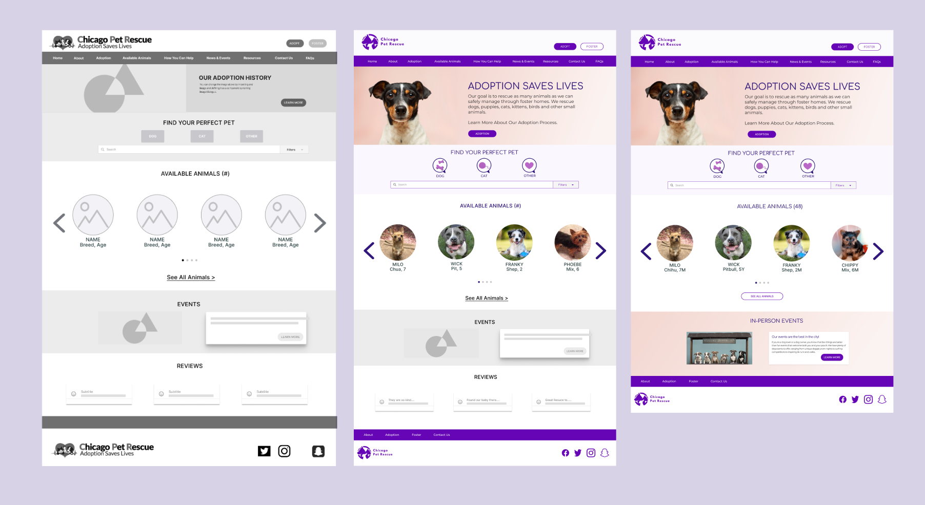
HOMEPAGE ITERATIONS
Removed the reviews section from the homepage since many users expressed they normally don't read or trust them.
-
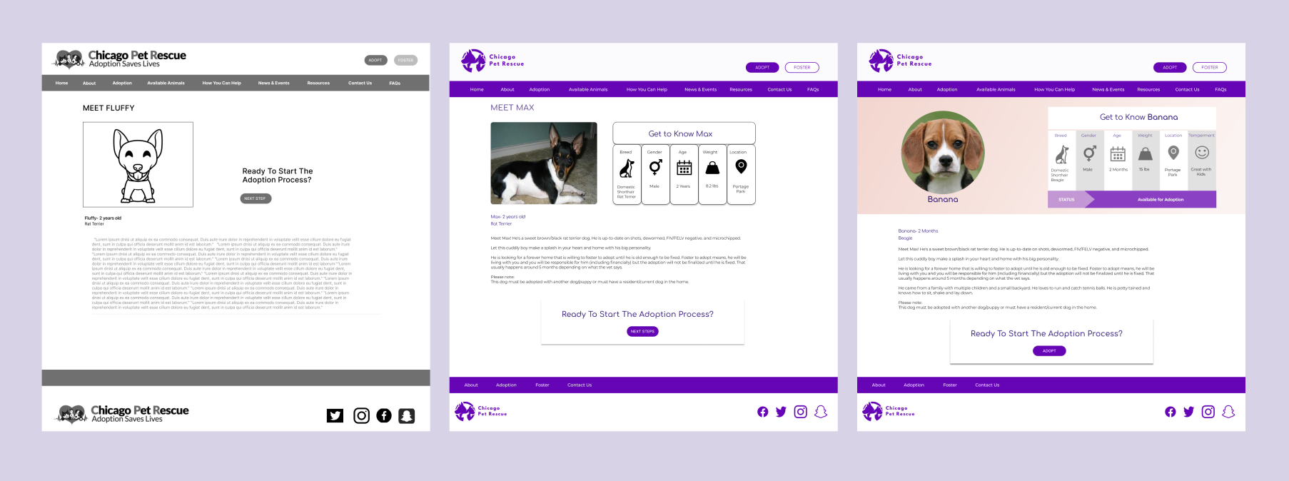
PET BIO PAGE
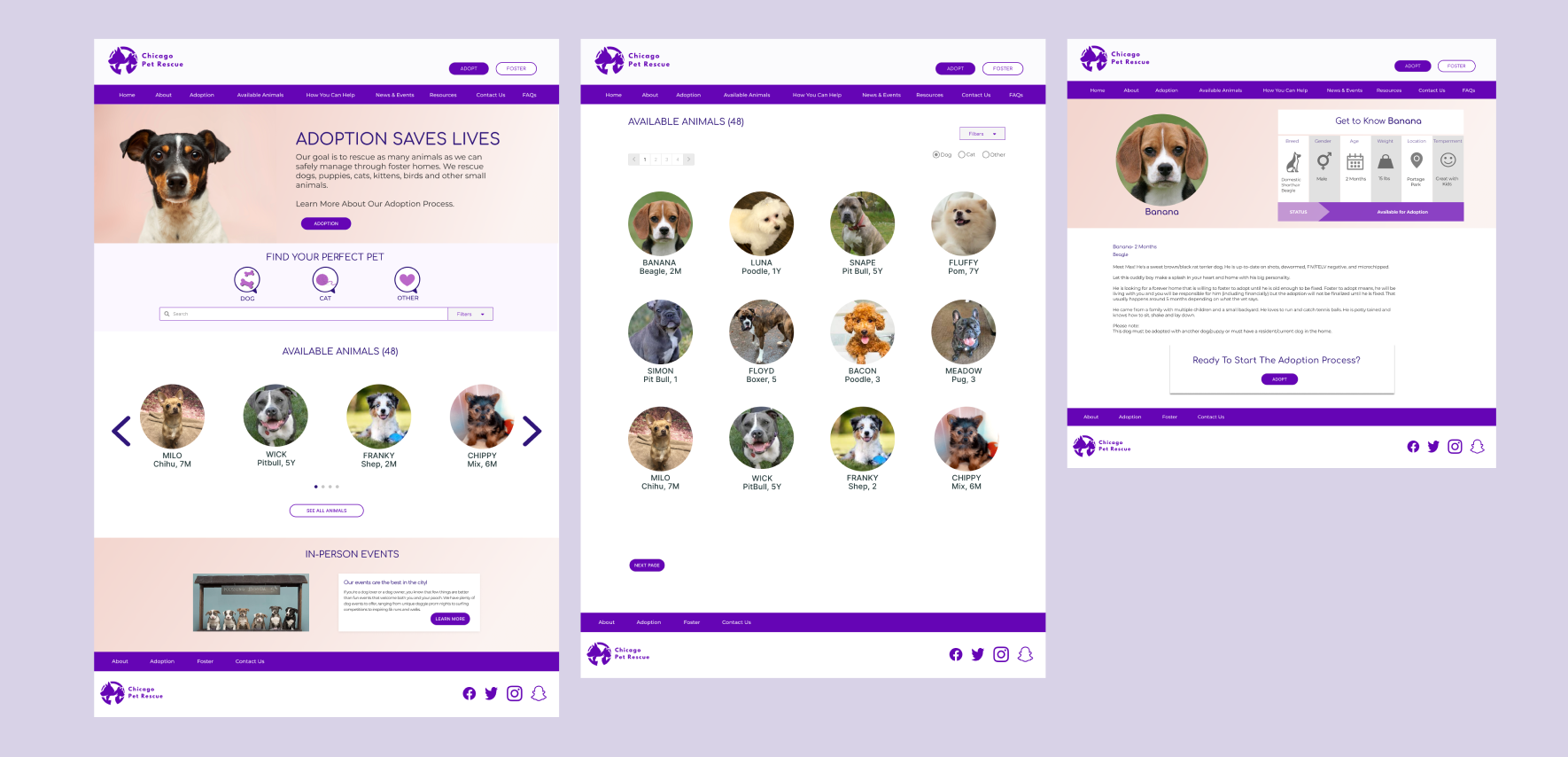
Added personalized information like Temperament into an clearly organized pet card for easy discoverability.
SUCCESSFUL SOLUTIONS
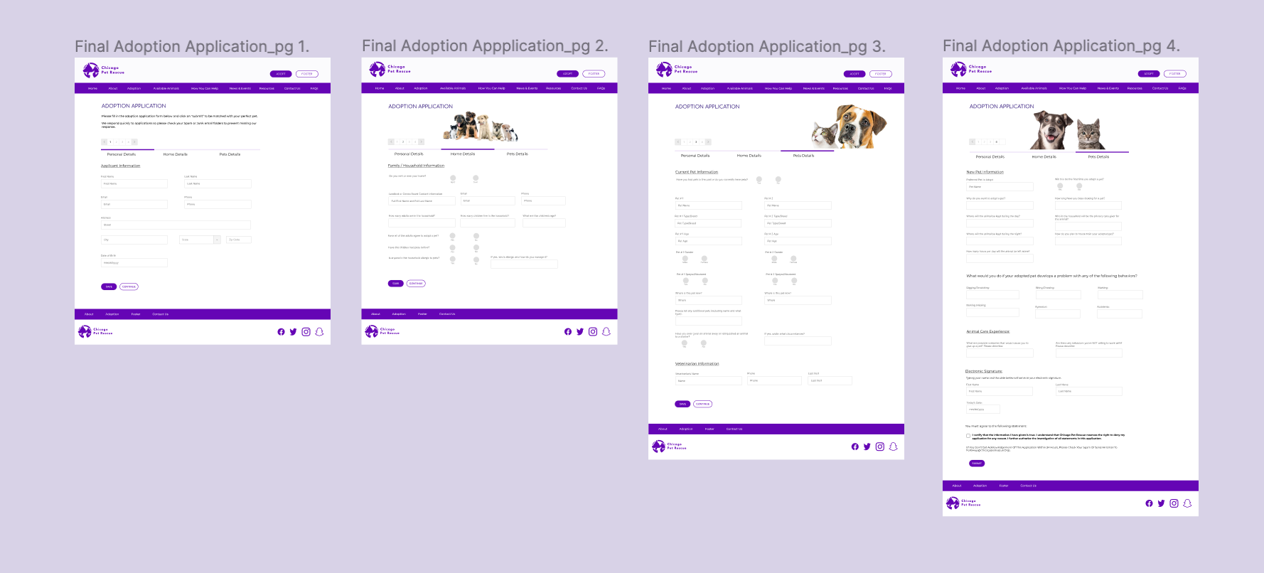
APPLICATION FORM

From an extra-long adoption application form that took 8 scrolls to a simplified form with saving options and only 4 clicks!
AVAILABLE PETS SECTION
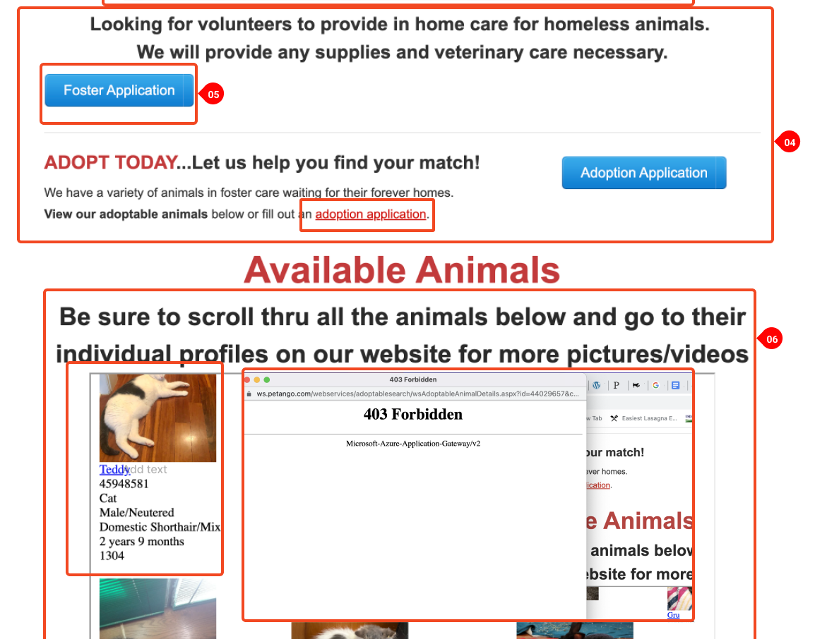
From error messages and broken links to a new and organized available pets section!
FUTURE STEPS
Add an interactive Events Calendar
Build out bio pages for each adoptable animal
Create email confirmation once the adoption form is filled out
Design a fully functioning donation page with a payment system built-in
Build out FAQ and Resources pages
Design the rest of the mobile responsive pages
