Group Travel App Design

TIMELINE
4 Weeks
MY ROLE
User Research, UX/UI Design
TEAM
Bea and Taylor
TOOLS
Figma, Figjam, InVision, Canva, PhotoShop,
OVERVIEW
As groups of people are starting to travel again after the pandemic, they’ll encounter new challenges and tools that can complicate the planning process. We want to understand the challenges they face specifically during the planning phase of traveling in a group.
THE PROBLEM
People struggle to successfully coordinate and finalize group travel plans. Often times efficient communication, disorganized travel documents, an unfair share of responsibilities, and procrastination can cause stress, frustration, and tension among the group members.
DESIGN CHALLENGE
How might we create an experience that addresses the communication challenges and inefficiencies of planning a vacation in a group chat and create a digital solution where all the travel information can be easily gathered and referenced?
THE SOLUTION
Plannr® is an app that helps groups traveling together plan their itinerary, manage their budget, centralize their travel information, and better coordinate with their travel companions.

USER RESEARCH
-
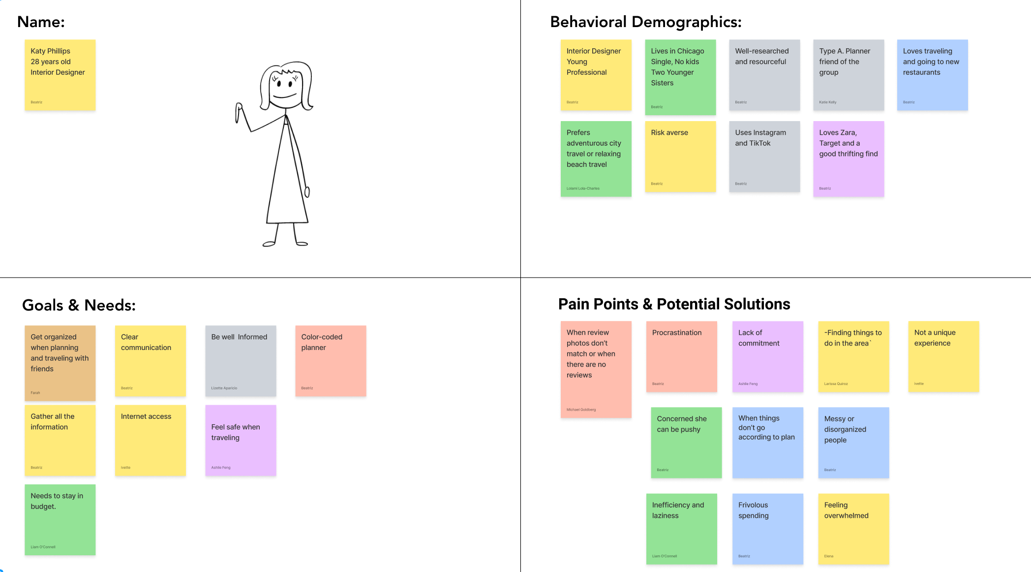
PROTO PERSONA
A proto persona served as starting point to understand the ideal user and his/her pain points, goals, and needs.
-
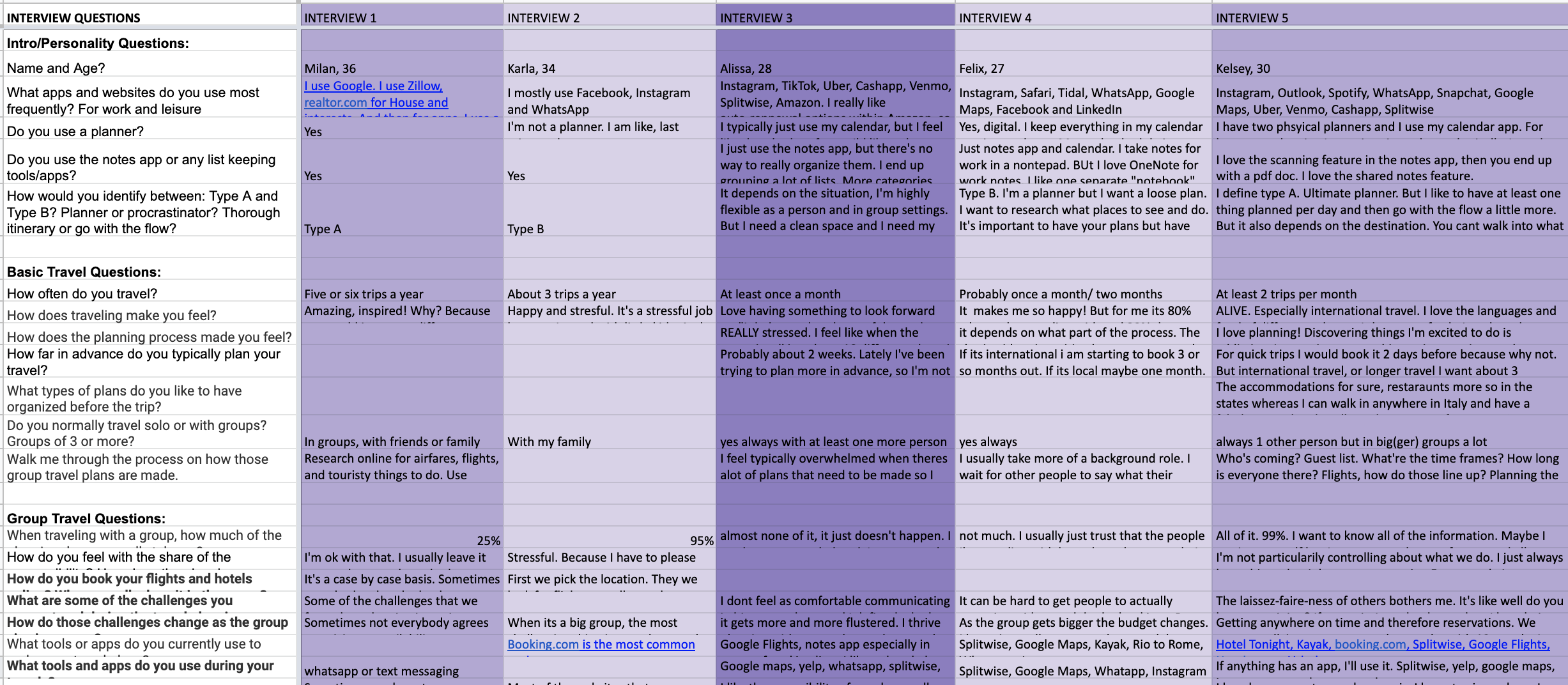
USER INTERVIEWS
We conducted user interviews to identify the challenges people face while making group travel plans
-
INTERVIEW TRANSCRIPTS
The interview data was transcribed to better understand and identify common threads.
-
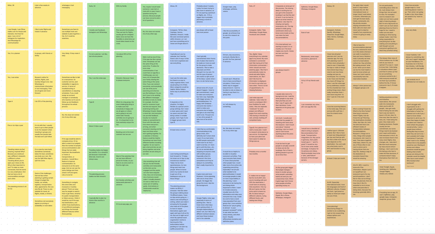
AFFINITY DIAGRAM
The interview data was organized into an Affinity Diagram which helped us sort and prioritize answers based on recurring themes and categories outlined by the team.
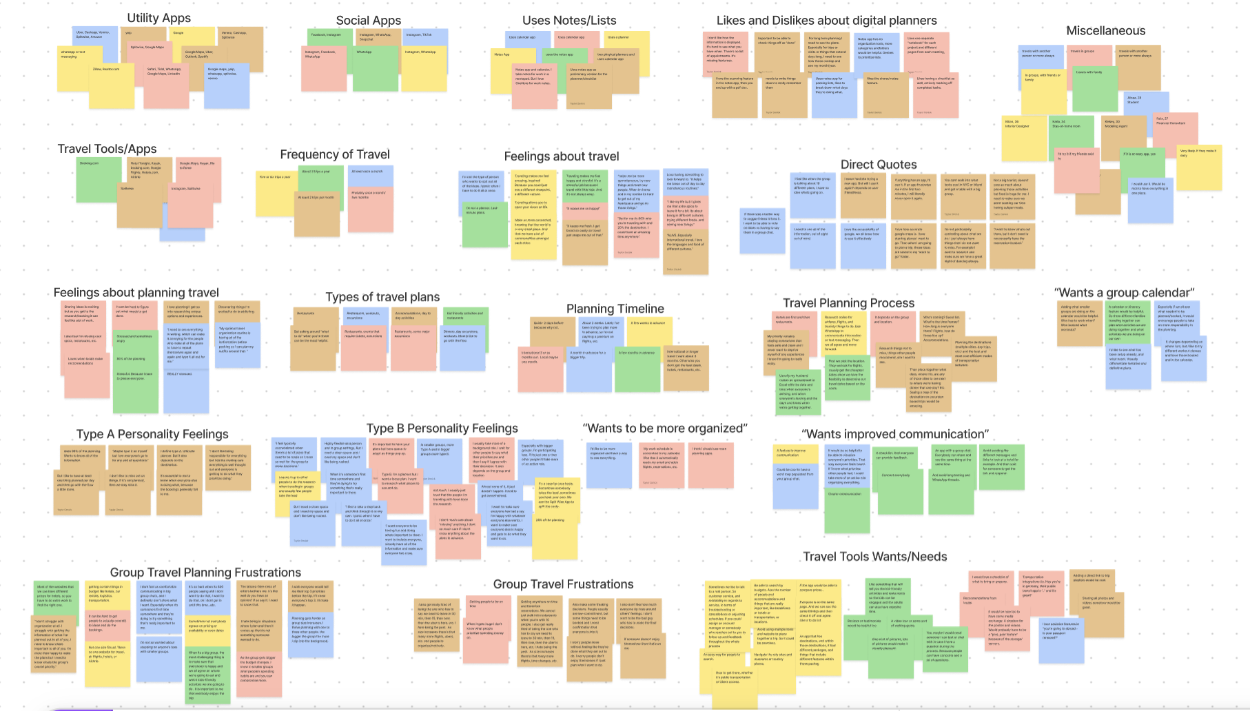
Interview Goals Was to Discern:
What information needs to be prioritized on the platform?
What types of plans do people want to organize before the trip?
What integrations would be advantageous to users?
How can we improve the overall experience of traveling in a group?
How does the planning process make you feel?
-
I’m ok with it. I usually leave it up to other people to take the lead and do the research.
-
Overwhelmed, procrastinates decisions, concerned with everyone getting a say.
-
I feel stressful, because I have to please everyone.
-
Excited to share ideas, puts off booking because it feels like a lot of work, wants to be told what to do.
-
LOVES planning, loves the research, frustrated with lack of fairness of others.

DEFINING THE PROBLEM
-
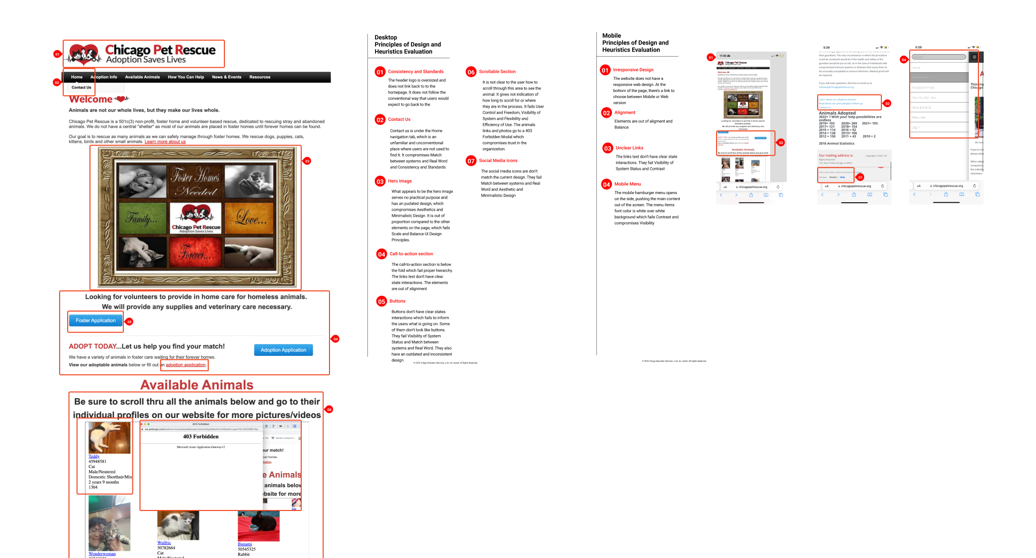
HEAURISTICS EVALUATION
We evaluated the site for its use of heuristics and UI practices and identified major weaknesses that needed to be addressed.
-
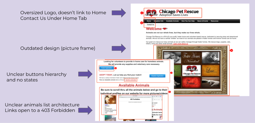
HIGHLIGHTED PROBLEMS
-
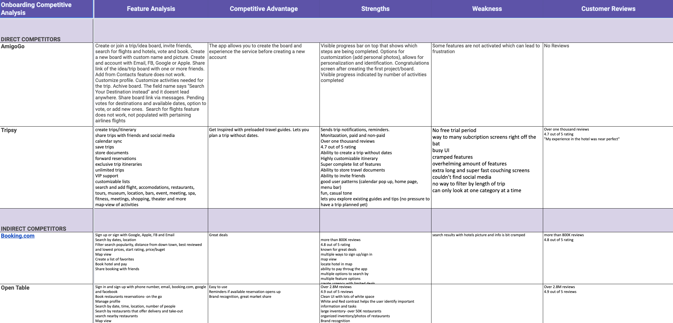
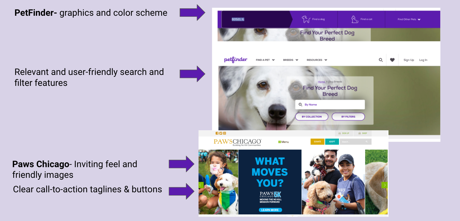
COMPETITIVE ANALYSIS
We gathered content that was used to inspire and inform our solution and lead us to originality.
-
HIGHLIGHTED IDEAS

IDEATION PHASE
-
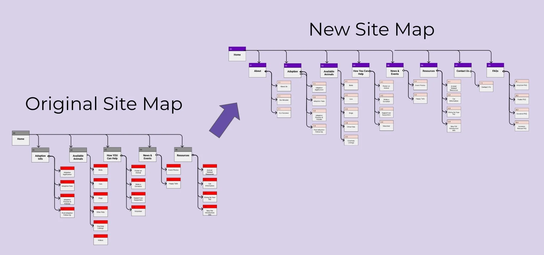
CARD SORTING AND SITEMAP
We went through the process of card sorting to start giving form to our ideas and solutions.
-
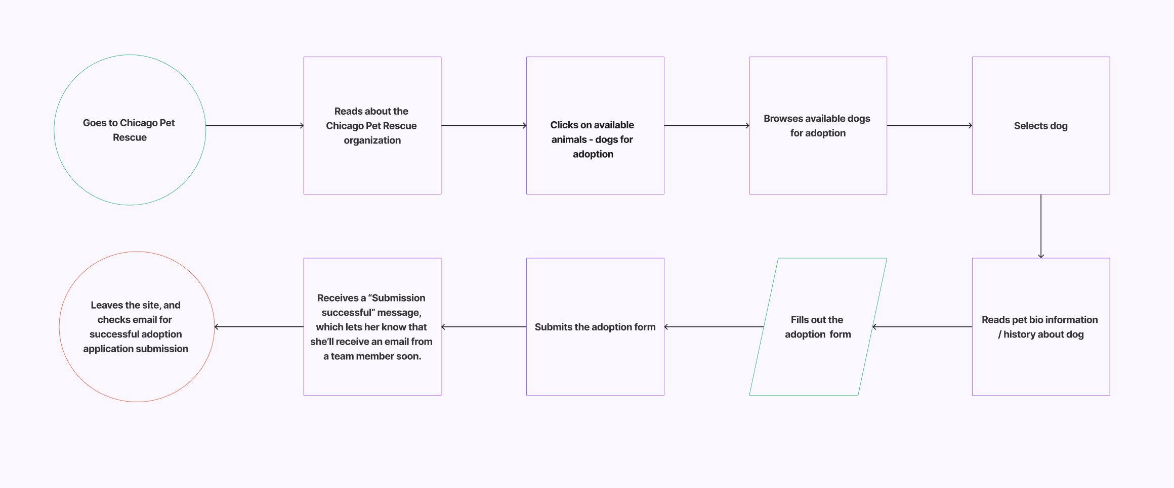
USER FLOW
We mapped out the user experience to identify the users steps and determine the design requirements to meet the users needs.
-
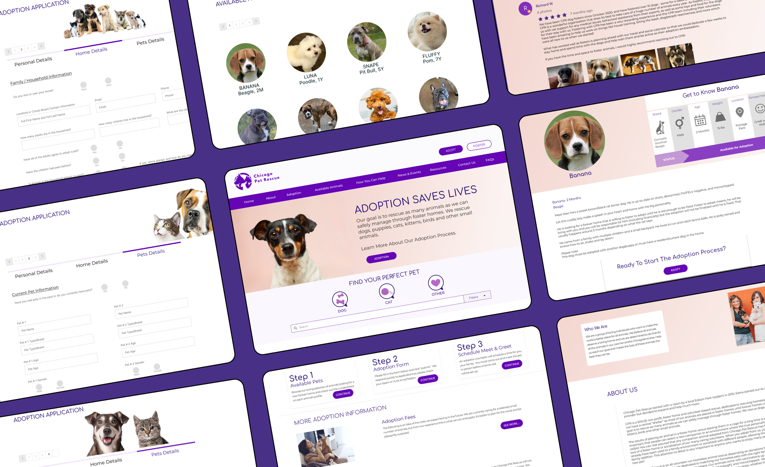
PROPOSED CHANGES BASED ON USER’S FEEDBACK AND WEBSITE EVALUATION:
Create a separate tab in the navigation for contact us
Move Adoption buttons before Foster buttons
Design a new/responsive hero image
Add Step-by-step adoption process
Add pet-finder/filter feature (by Pet Type/Breed/Proximity)
Organize/redesign pets scrollable section
-
Reduce overall website copy
Add a proper footer button
Redesign buttons with state interactions
Update social media icons
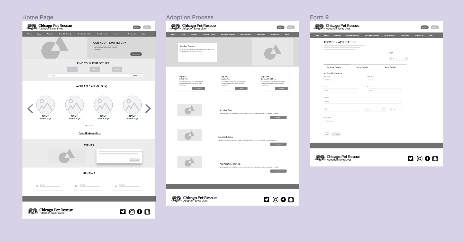
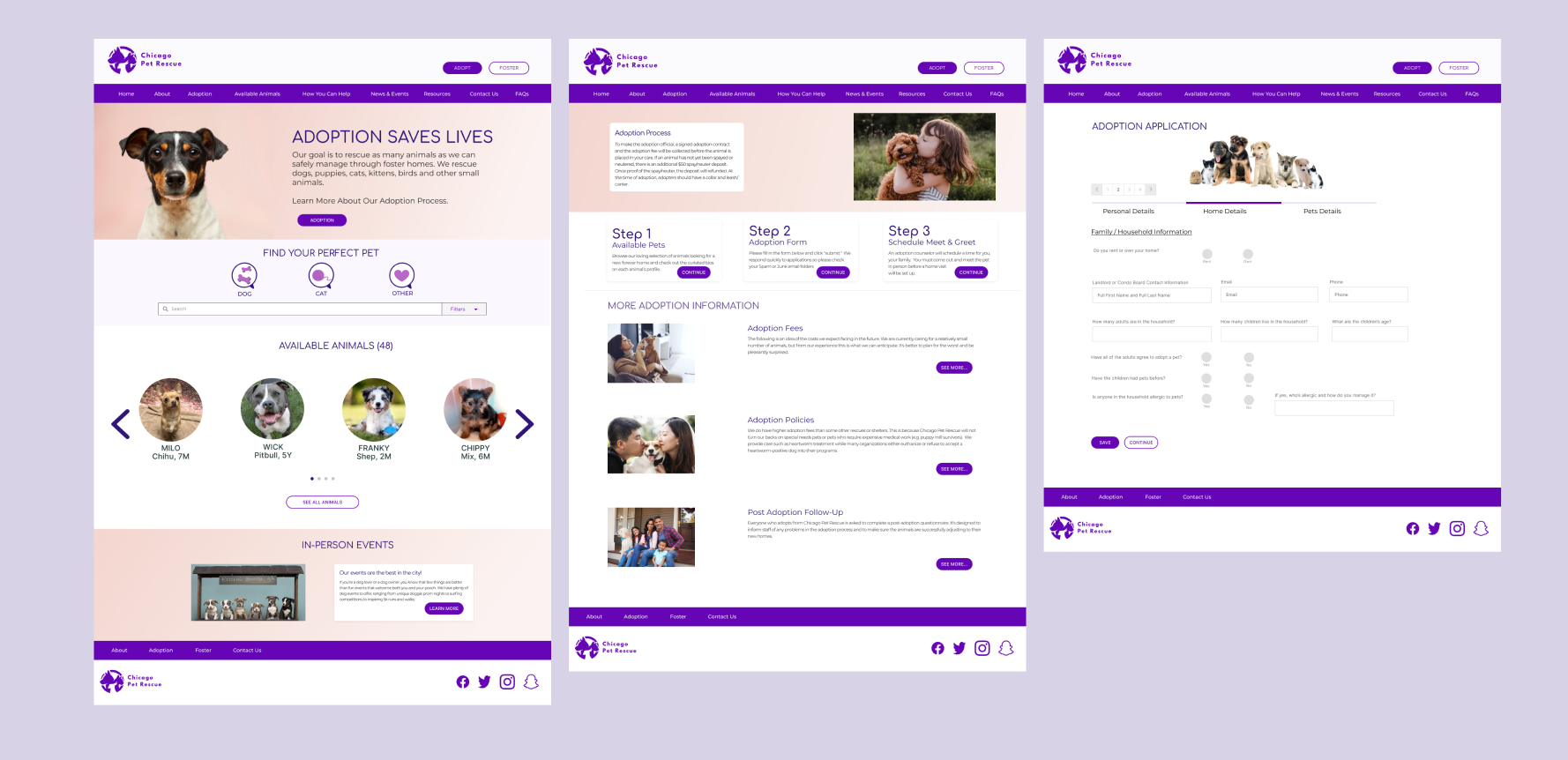
Reduce application form length and divide into separate pages with a progress bar

PROTOTYPE
-
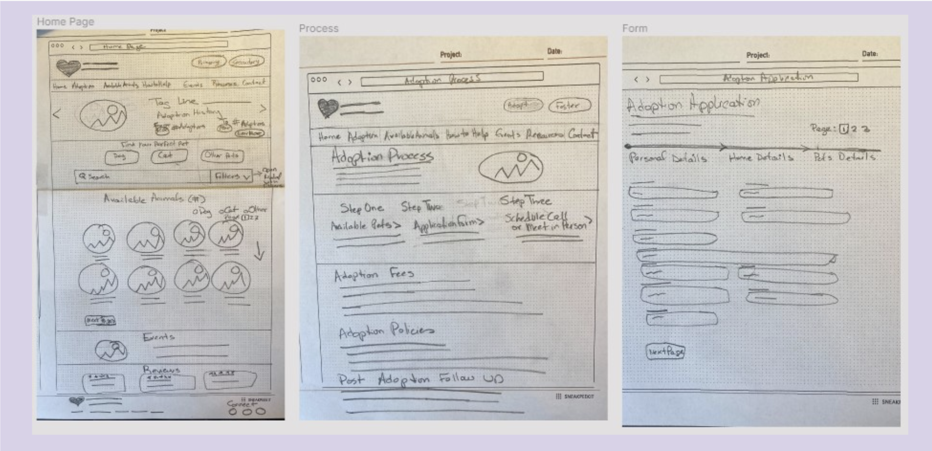
PAPER SKETCHES
With the initial concept in mind, we quickly generated sketches for possible solutions.
-
LOW-FIDELITY WIREFRAMES
The concept was translated into a few simple wireframes with a low-degree of complexity
-
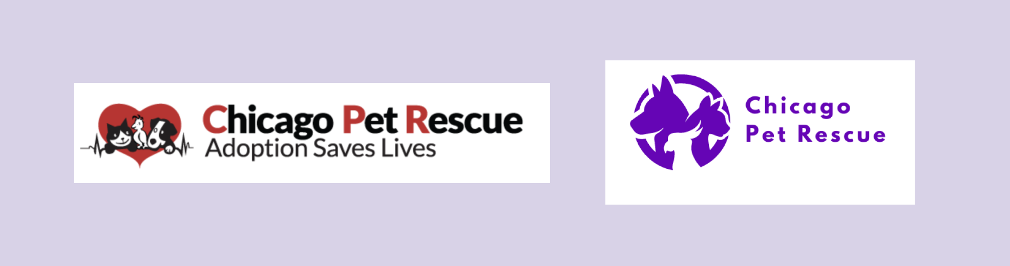
REDESIGNING BRAND IDENTITY
The new logo design was based on more contemporary look of a combination of the three kind of animals from the original logo.
-
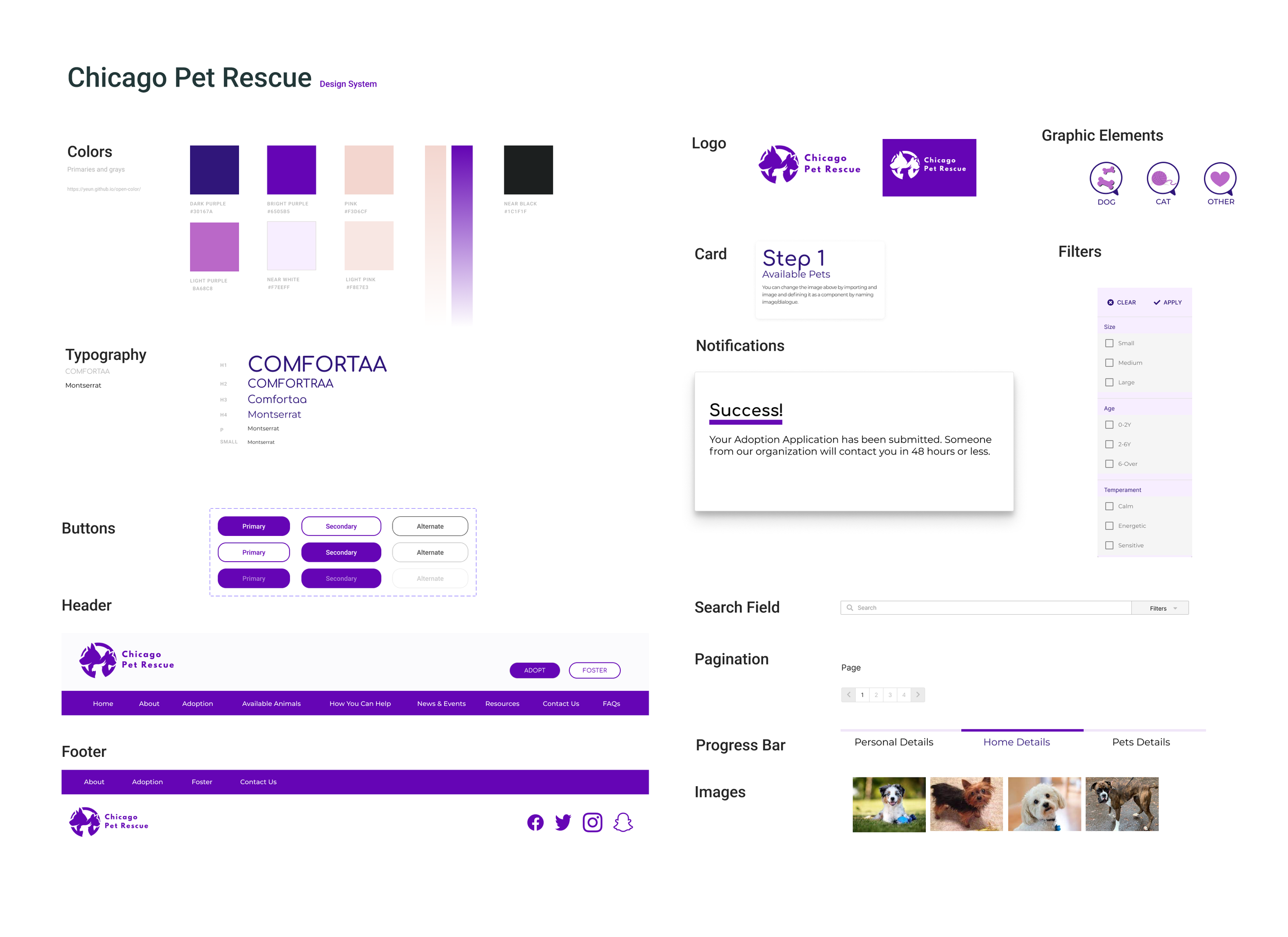
UI STYLE GUIDE
-
HIGH-FIDELITY PROTOTYPE
A style guide was defined to apply an original brand style to a more robust prototypes.
-
CLICKABLE PROTOTYPE WITH REUSABLE COMPONENTS
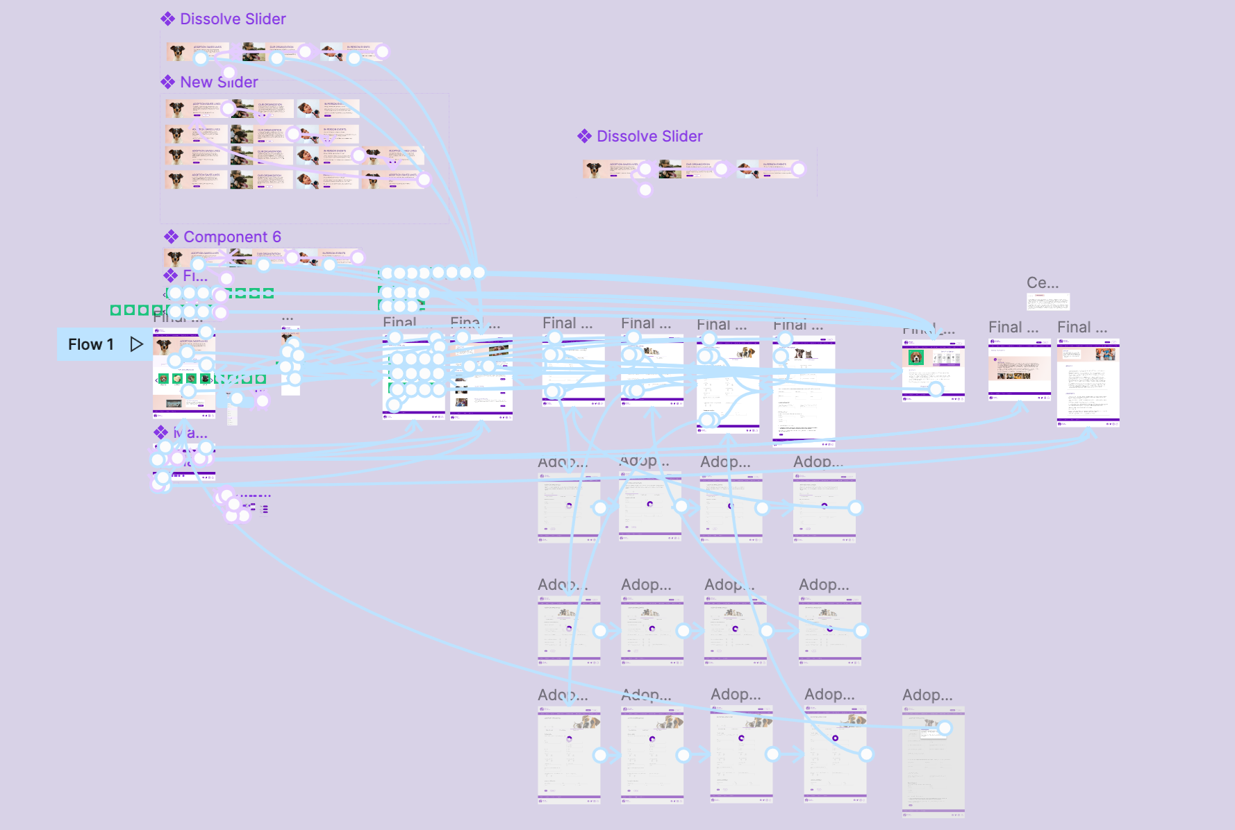
CHECK IT OUT!

TESTING
-
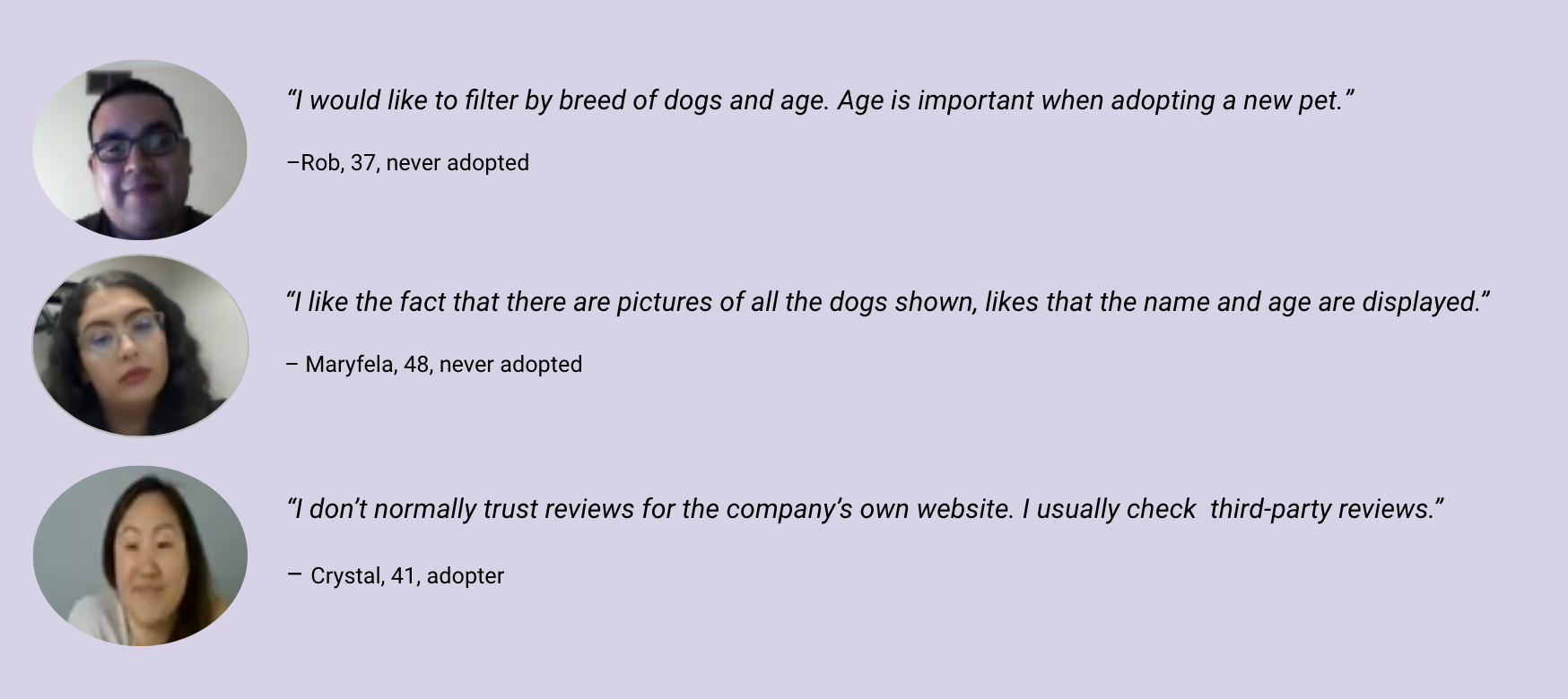
TESTING INTERVIEW DATA
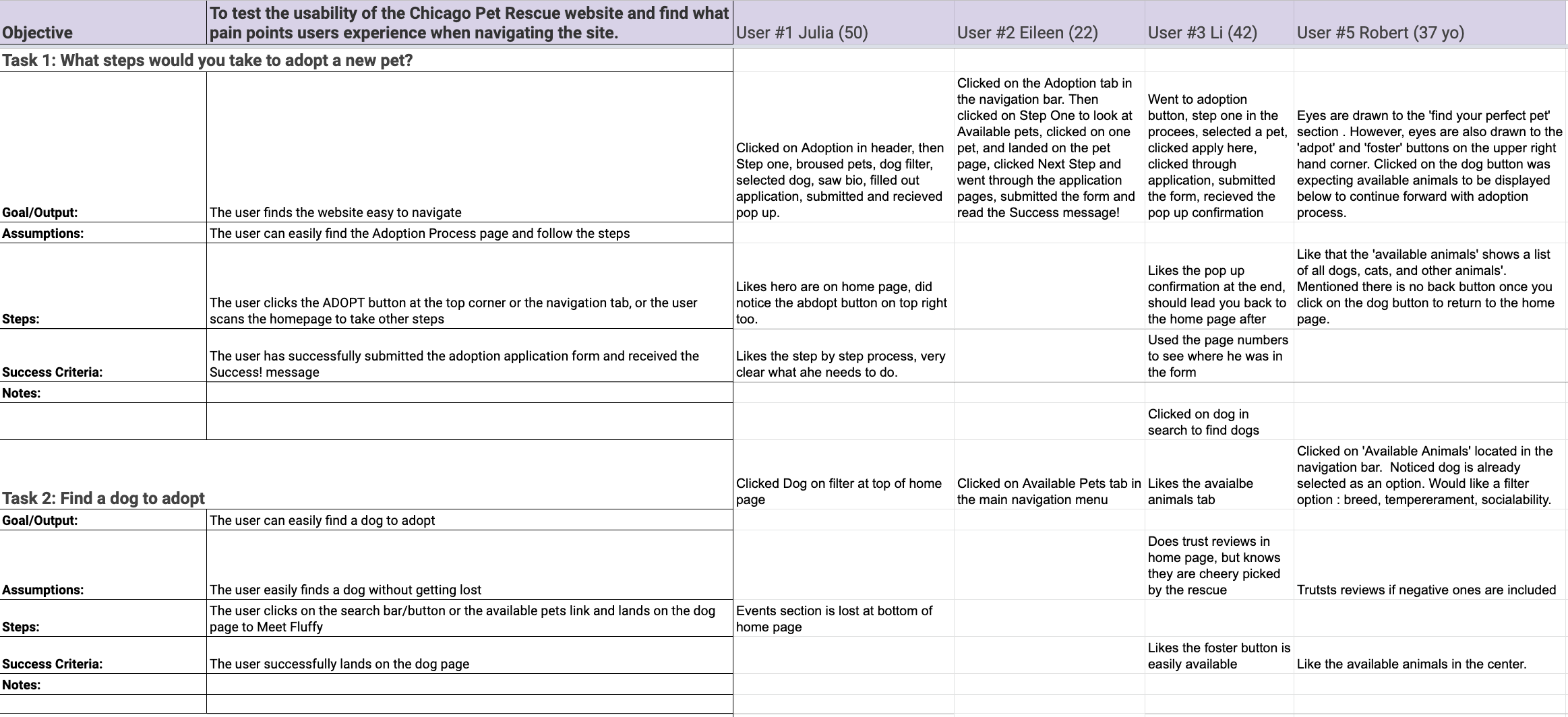
-
USER INTERVIEW COMMENTS
-
USER SUGGESTED CHANGES
Next Step button(Bio) should lead to adoption form, not adoption process
Show the number of animals availablE
Add temperament section to bio card
Add what pet you are interested in to the adoption form
Show more diversity in images for About page
Add more spacing or larger text to About page
-
Reviews page, bio, about shorten text length
Add additional info on pets (backstory/training)
Larger text on Adoption page or gets larger on hover
Add trigger to scroll down on adoption page Thinner footer?
Replace foster button with donate
Arrange available animals in some sort of order
ITERATIONS
-
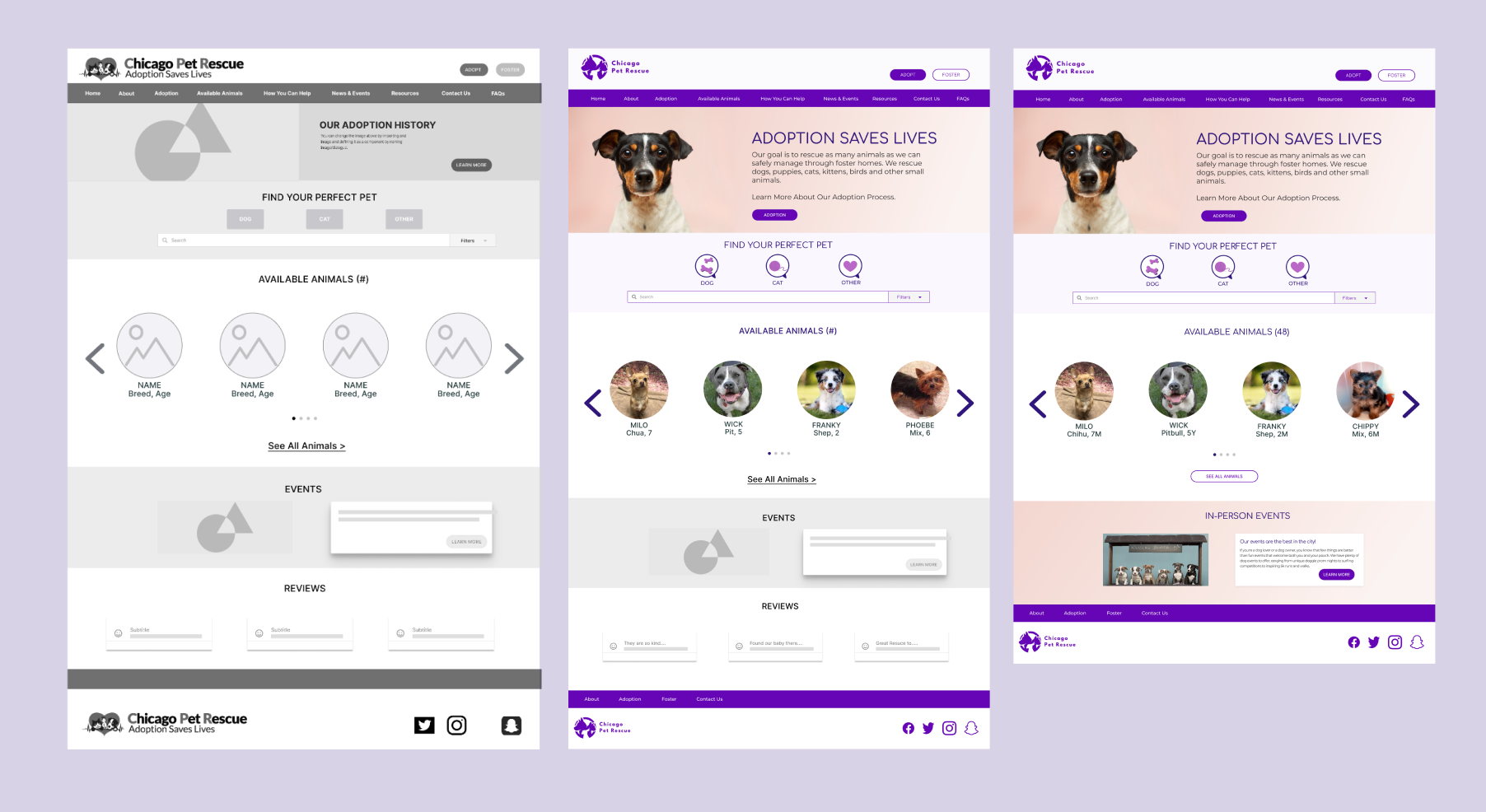
HOMEPAGE ITERATIONS
Removed the reviews section from the homepage since many users expressed they normally don't read or trust them.
-
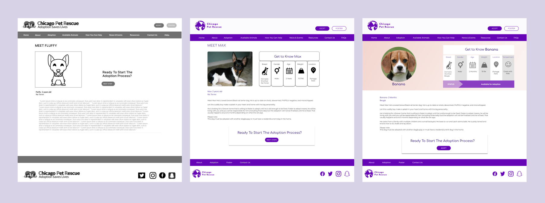
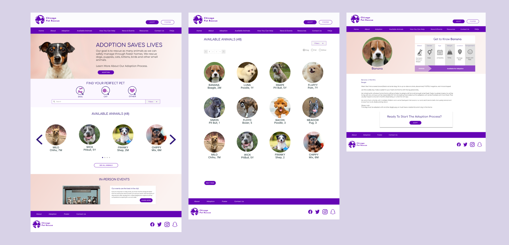
PET BIO PAGE
Added personalized information like Temperament into an clearly organized pet card for easy discoverability.
SUCCESSFUL SOLUTIONS
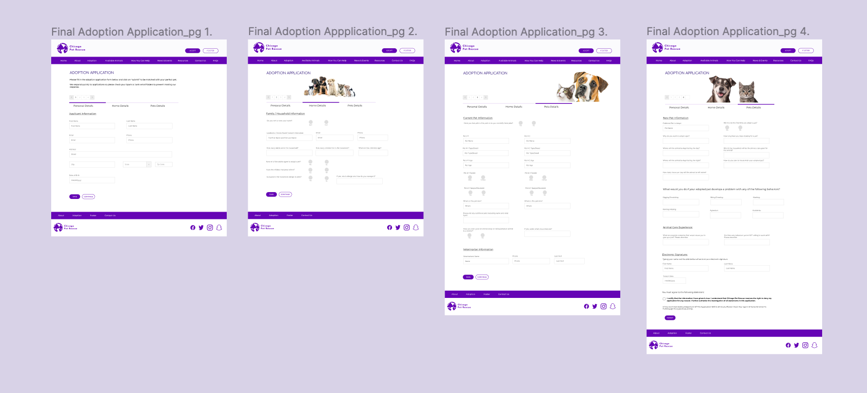
APPLICATION FORM
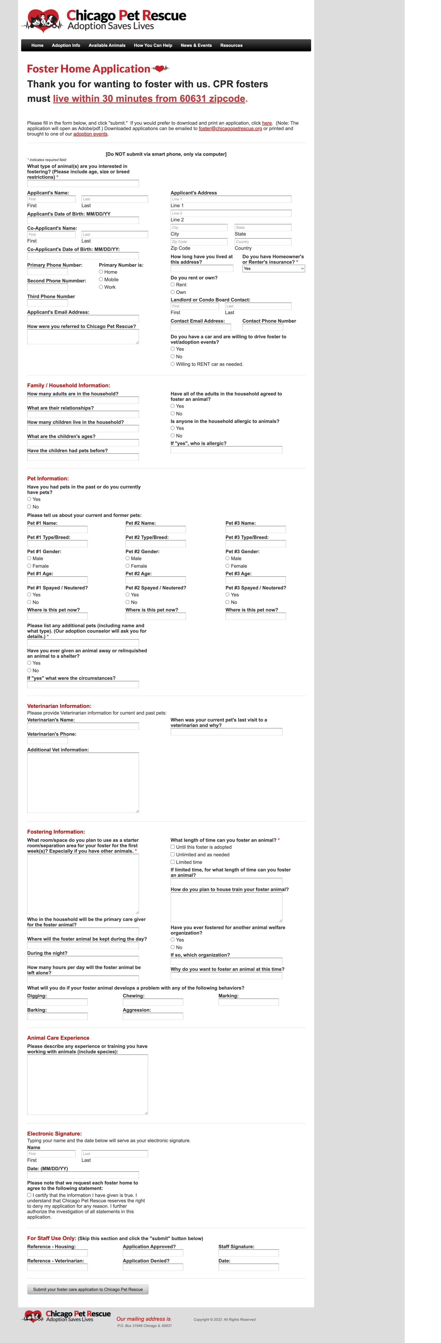
From an extra-long adoption application form that took 8 scrolls to a simplified form with saving options and only 4 clicks!
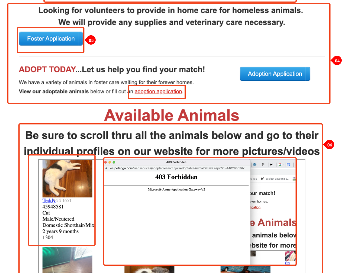
AVAILABLE PETS SECTION
From error messages and broken links to a new and organized available pets section!
FUTURE STEPS
Add an interactive Events Calendar
Build out bio pages for each adoptable animal
Create email confirmation once the adoption form is filled out
Design a fully functioning donation page with a payment system built-in
Build out FAQ and Resources pages
Design the rest of the mobile responsive pages