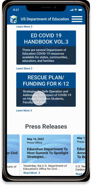
US Dept. Of Education Responsive Web Design

TIMELINE
Week 1- User Research and Solution Synthesis
Week 2- Responsive Wireframe and Prototypes
Week 3- Usability Testing
MY ROLE
User Research, Website Analysis, Information Architecture, Responsive Redesign Wireframe, Prototype
TEAMBea, Beth Ann, Michael, Terrell
TOOLS
Figma, Figjam, InVision, Canva, PhotoShop
OVERVIEW
When navigating the US Department of Education website users encountered frustration with the overwhelming amount of disorganized information and visual clutter. They struggled to navigate the site because of many broken links, confusing jargon and headers, outdated information, and unclear links and flow. The main objective of this project was to provide the user with a clear and balanced path that will allow them to effortlessly find the information they are looking for. We solved this problem by establishing an information hierarchy, eliminating redundancy, simplifying the navigation, and applying aesthetic and minimalist design to a new user interface.
THE PROBLEM
Users were frustrated with the overwhelming amount of disorganized information and visual clutter. They struggled to navigate the site because of many broken links, confusing jargon and headers, redundant information, and unclear links and flow.
THE SOLUTION
Provided the users with a clear path to effortlessly find the information they were looking for through proper information hierarchy, simplified navigation, and more current and minimalist responsive web design.

UNDERSTANDING THE USER
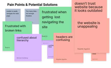
Broken Links
Page Not Found
Confusing Headers
Unclear Path
Visual Clutter
Lack of Trust
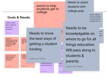
PROTO PERSONA
A proto persona was created so we could see the problem from the user's perspective and guide our actions, efforts, and design decisions.
USER FLOW
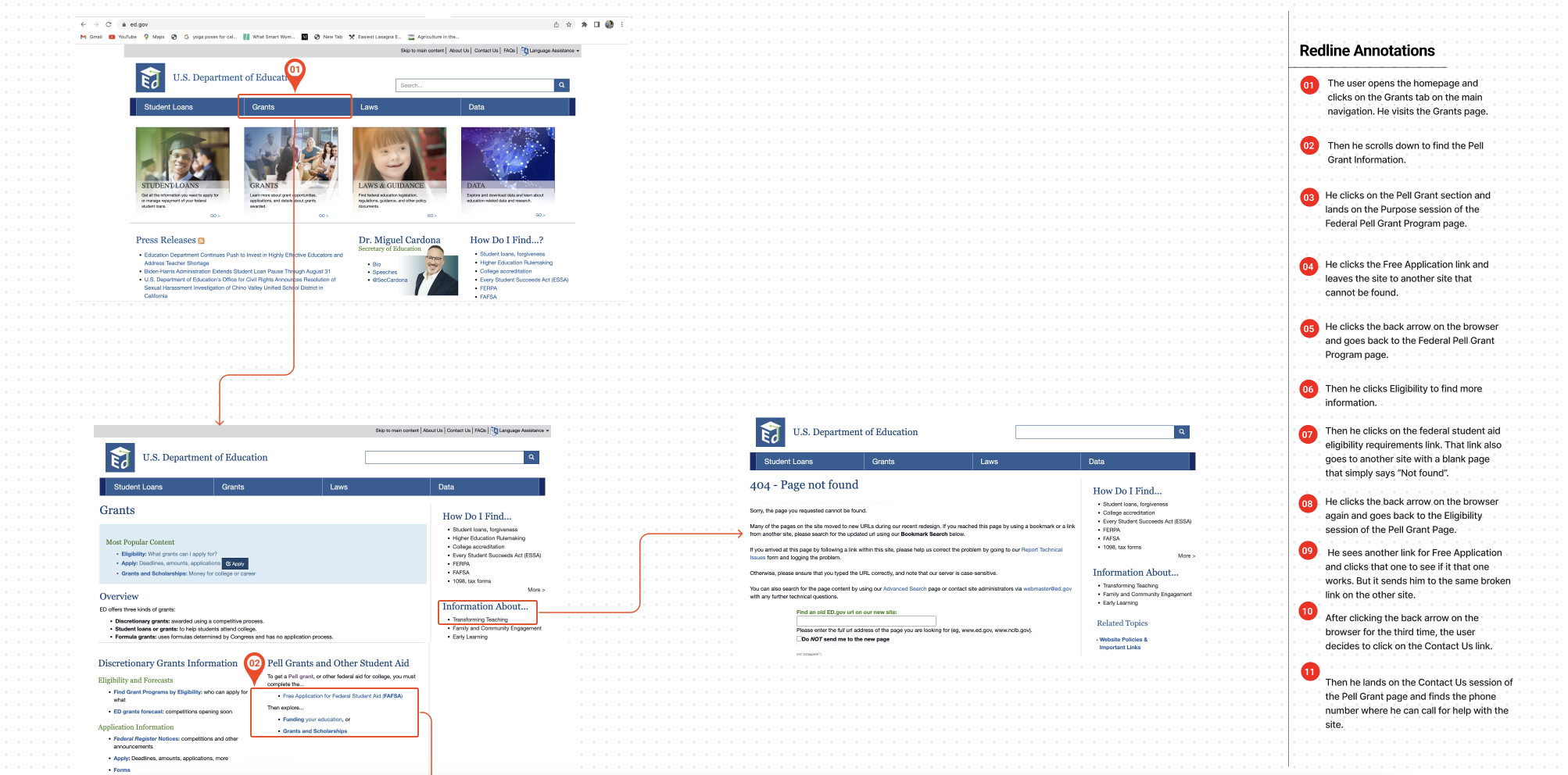
We analyzed a typical user path based on the conclusions of our proto persona. We annotated the path, noting where our users would run into problems based on our understanding of design and heuristic principles.

DEFINING THE PROBLEM
Information redundancy
Inconsistency caused confusion
Users felt lost on the site
Website was unappealing
WEBSITE ANALYSIS
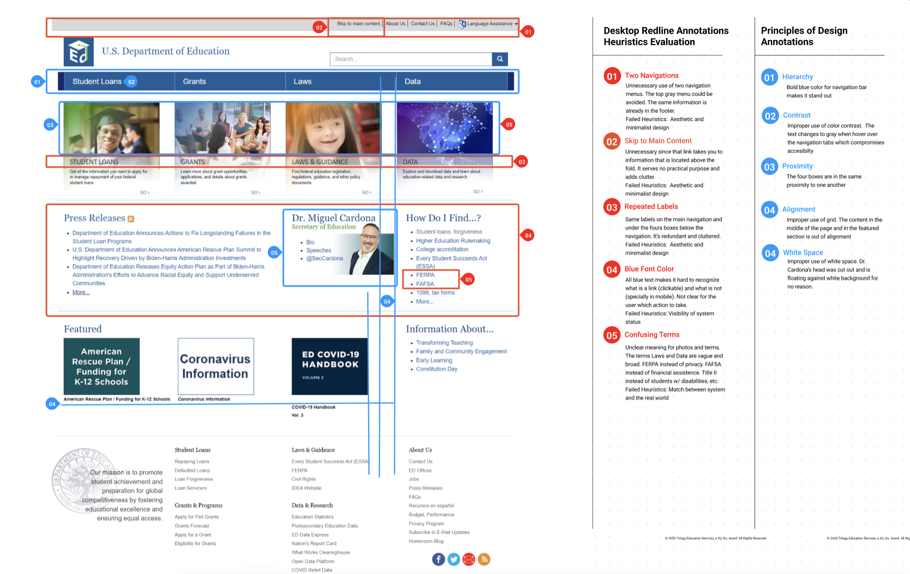
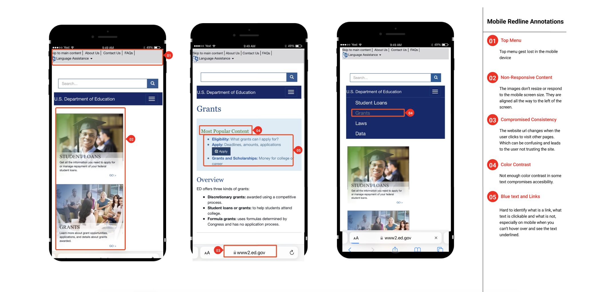
The website presented compromised usability and design principles. We found overwhelming, disorganized, redundant information, compromised aesthetics, and minimalistic design, failed visibility and accessibility, and jargon that created confusion. Among other issues were a lack of consistency, improper use of hierarchy, contrast, alignment, and white space.
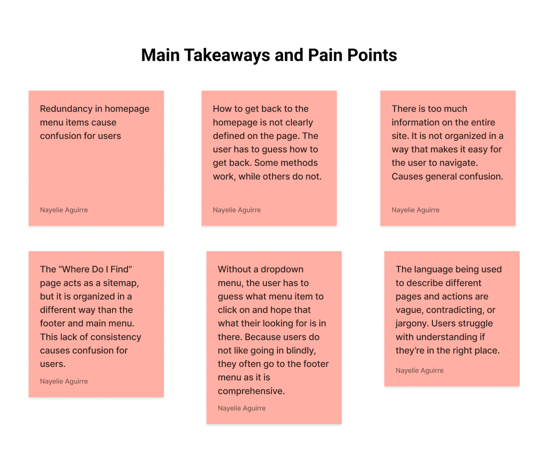
USER TESTING NOTES
OLD SITE USABILITY TESTING FINDINGS
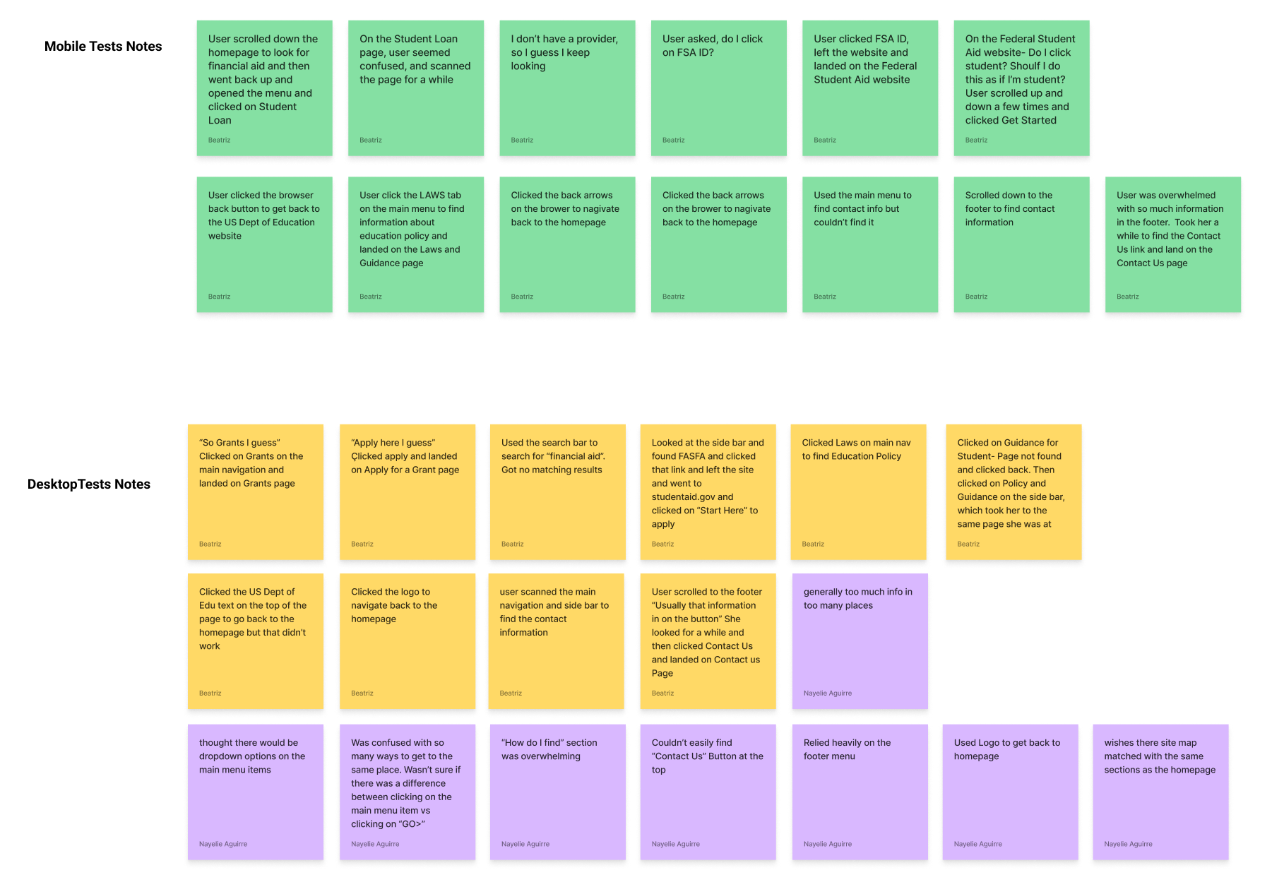
Unclear how to get back to the homepage
Contact Us information in the universal navigation was overlooked and Users went to the footer instead
Users relied on guessing to find information
Users struggled to understand where they were on the site
Redundancy and inconsistency caused confusion


IDEATING SOLUTIONS
Proper information hierarchy- prioritize relevant content, rename primary and secondary pages
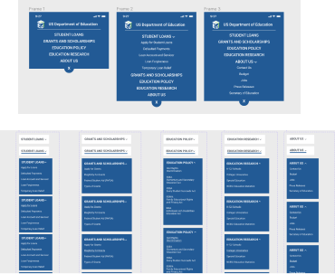
Simplify navigation- dropdown menu, eliminate sidebar, cleaner footer
Proper use of links color
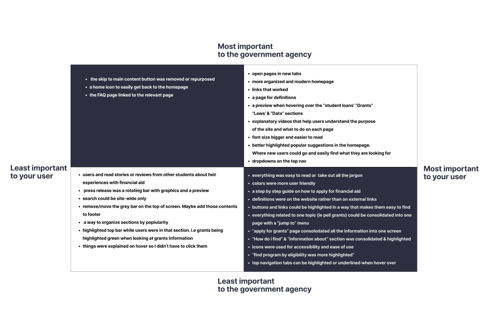
PRIORITIZATION MATRIX
The usability testing feedback was organized using the I like, I wish, What If method and sorted into a prioritization matrix that allowed us to brainstorm a solution to target the most relevant needs of our users.
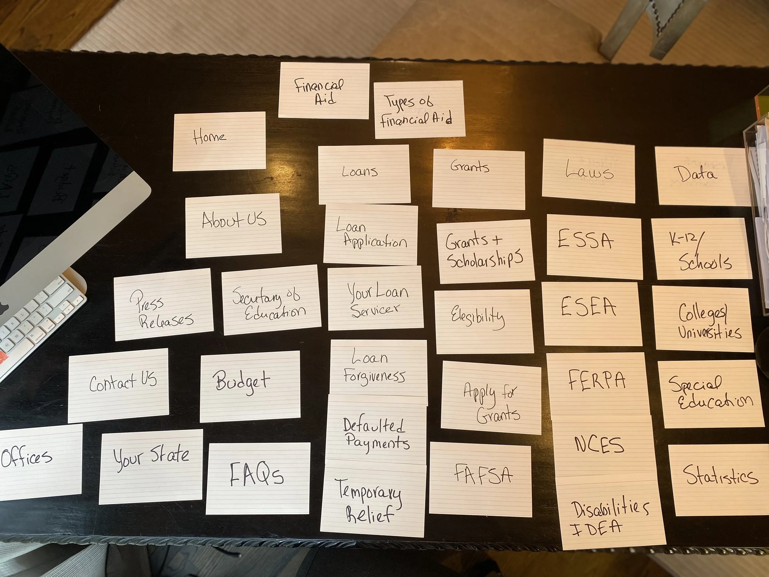
CARD SORTING
Went through a few cards sorting iterations and organized, categorized, and renamed the primary and secondary pages as well as the footer pages using LATCH, incorporated dropdown menus, reduced the number of links in the footer and eliminated the sidebar, and relocated those links.
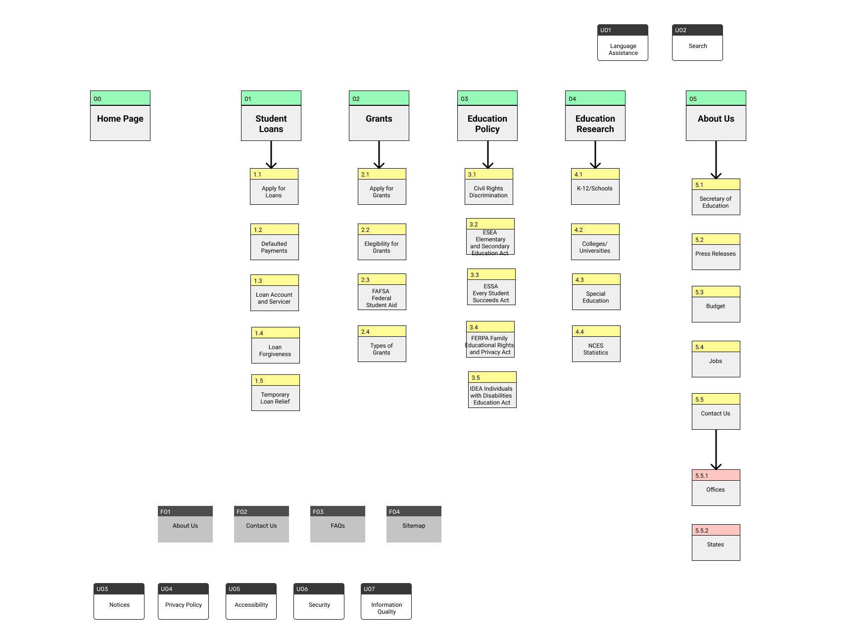
SITE MAP
A new information hierarchy was designed to organize the most relevant content, eliminate redundancy and simplify navigation.
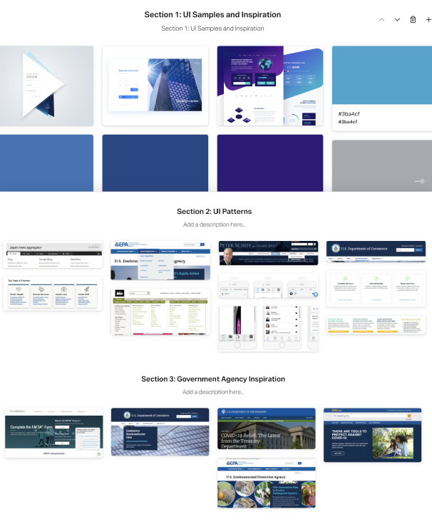
INSPIRATION BOARD
We gathered design ideas from other government agencies that were used to inspire and inform our solution and lead us to originality.
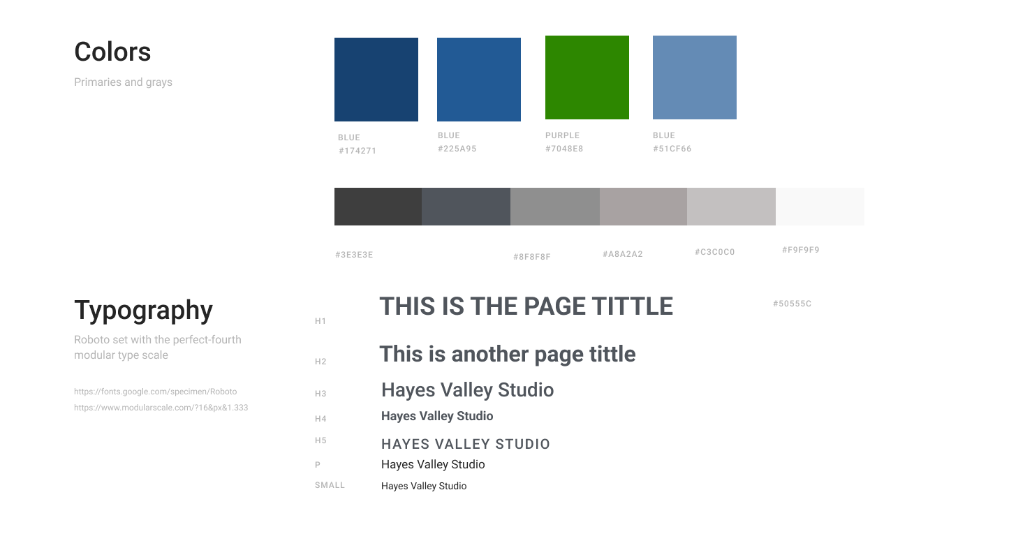
Style Guide
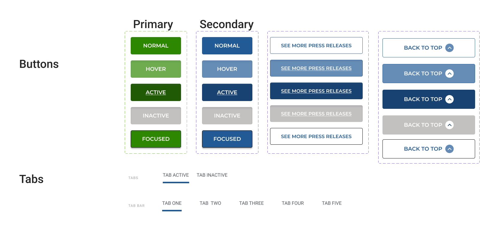


PROTOTYPE
Branding and Style Guide Applied to
High-Fidelity Responsive Clickable Prototype
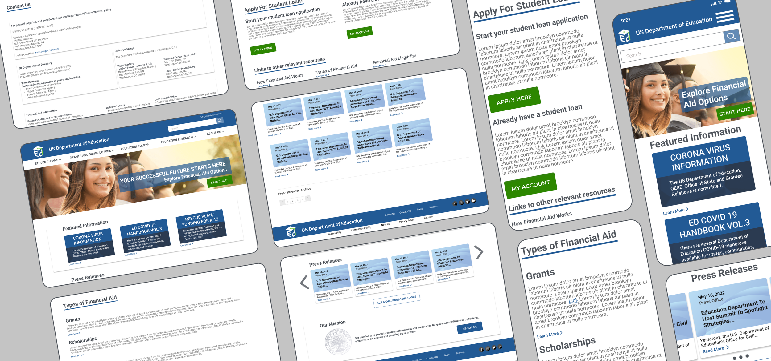
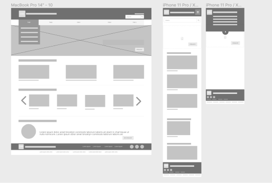
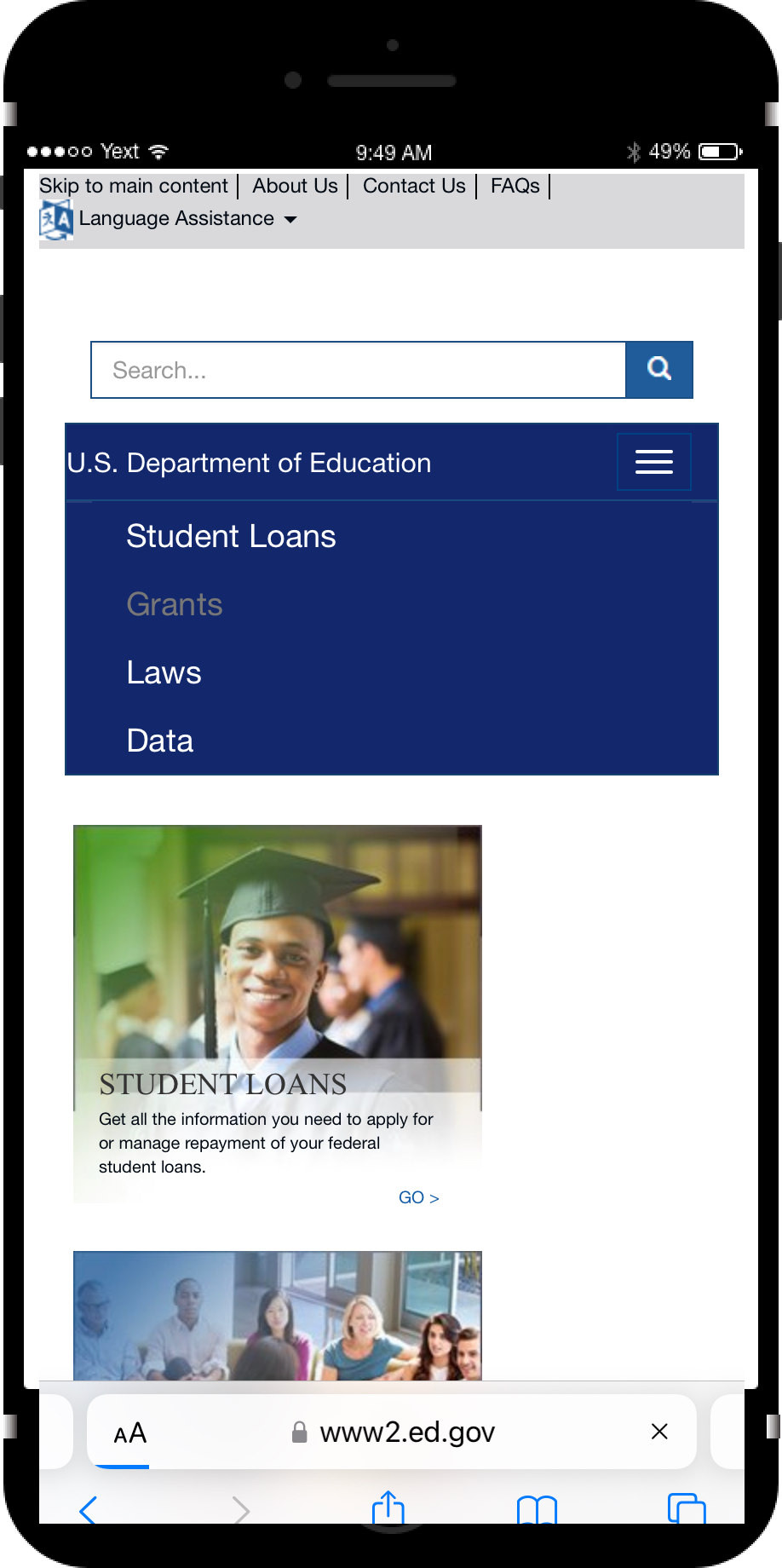
DESKTOP AND MOBILE WIREFRAMES
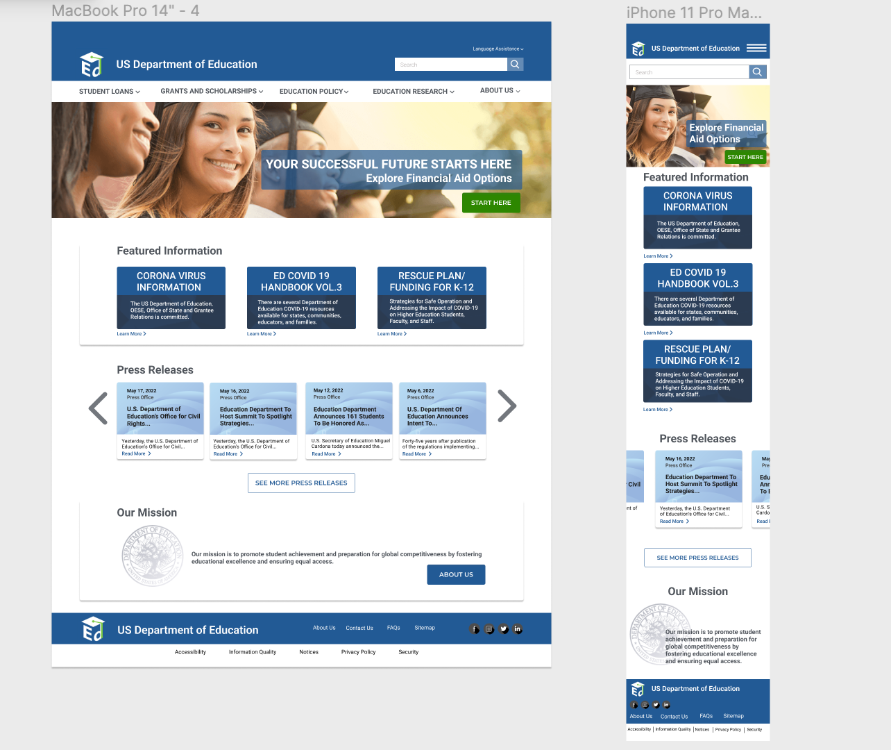
HIGH-FIDELITY PROTOTYPE
NAVIGATION REDESIGN
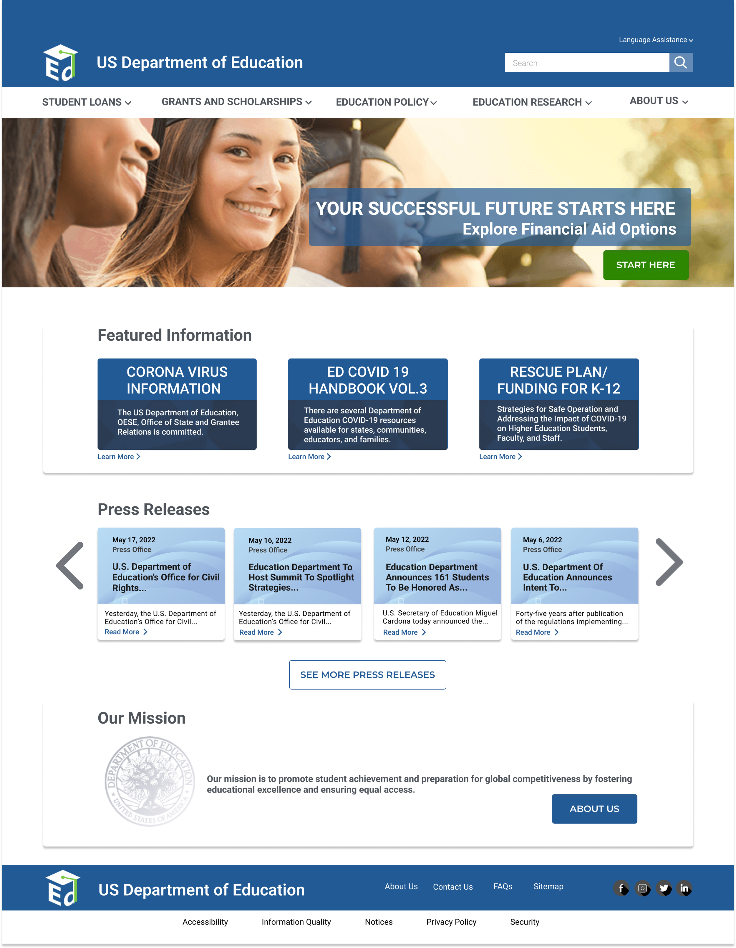
Applied the new sitemap and information hierarchy to the navigation and homepage wireframes.
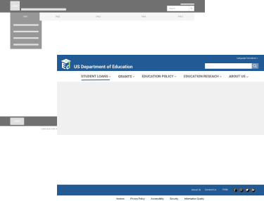
DROPDOWN MENU
To solve the information redundancy and clutter issue, we gave the users what they suggested- "dropdown options on the main menu items".

TESTING & ITERATING
INTERACTIVE PROTOTYPE
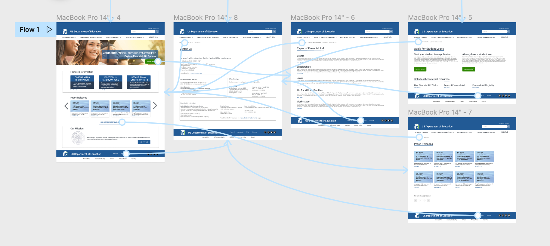
PROTOTYPE TESTING KEY FINDINGS
Users were expecting to click on the agency name to navigate back to the homepage
The blue call to action button was overlooked and lost against the tagline background. We changed it to a green color button for better color contrast.
No link to Apply for Student Loan under the financial aid page restricted the user flow
The press releases carousel interaction was not working
Some buttons states were not working
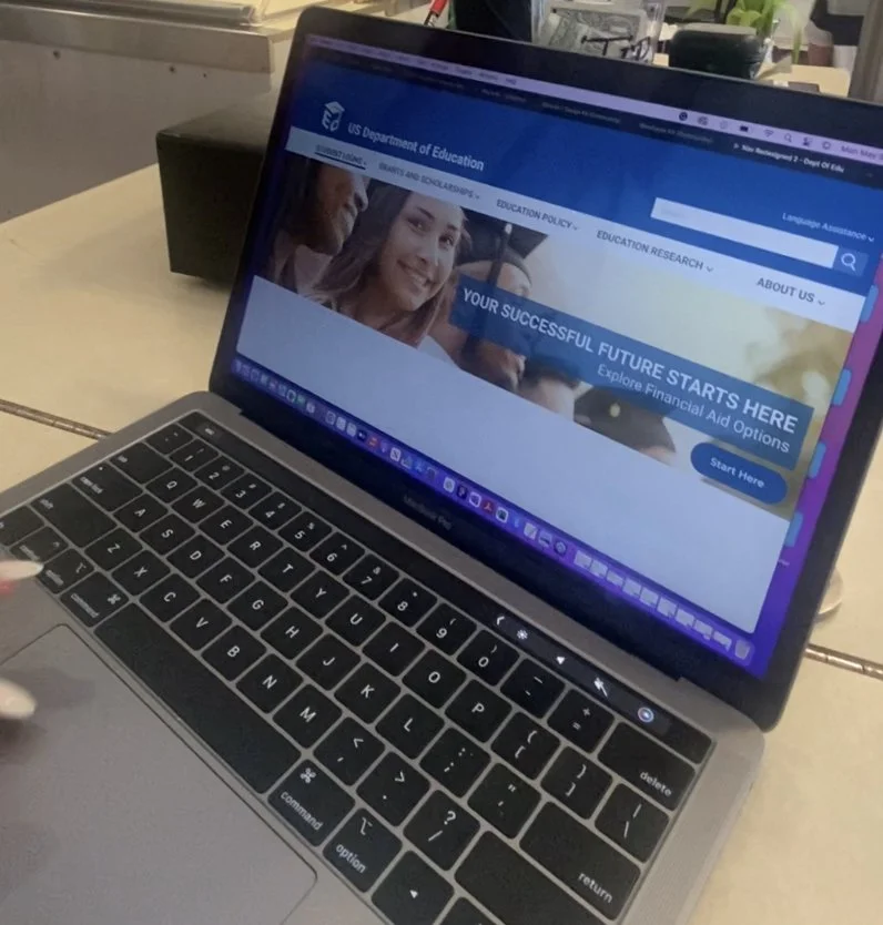
CONCLUSIONS AND OVERALL IMPROVEMENTS
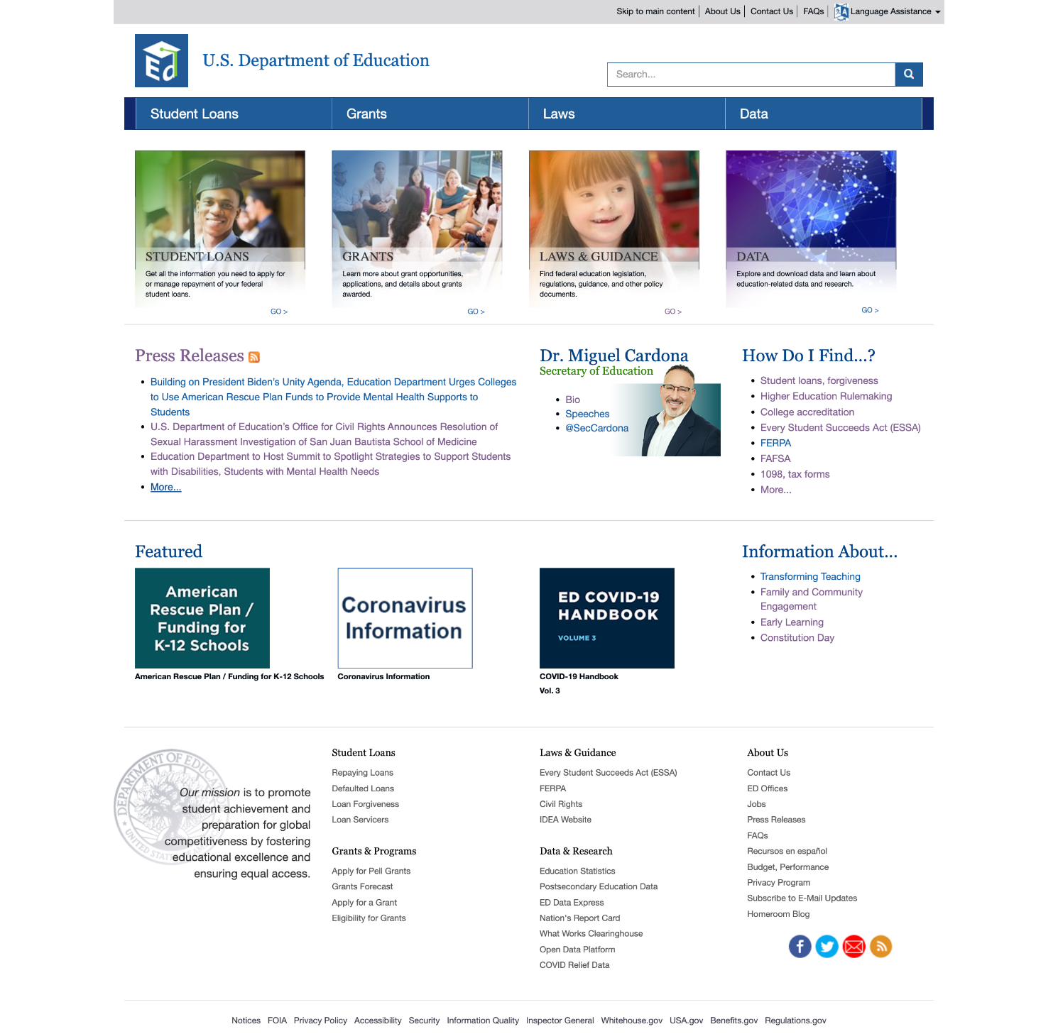
By removing the four boxes below the navigation, we eliminated information redundancy
To solve visual clutter, we removed unnecessary universal navigation at the top of the page
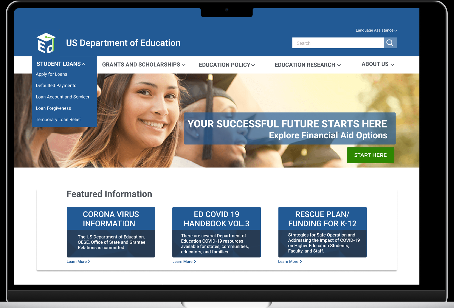
Redesigned main navigation with a dropdown menu to reduce complexity
Added hero image with banner and call-to-action to establish hierarchy and homepage focal point
Eliminated side navigation since the links were not easily identified and had no container
Redesigned press releases area to achieve aesthetic design
Kept the Contact Us link on the footer since it is the user’s natural search tendency
Simplified footer navigation since it was taking too much real estate, especially on mobile
Eliminated overall jargon and improved contrast with font color to eliminate links confusion
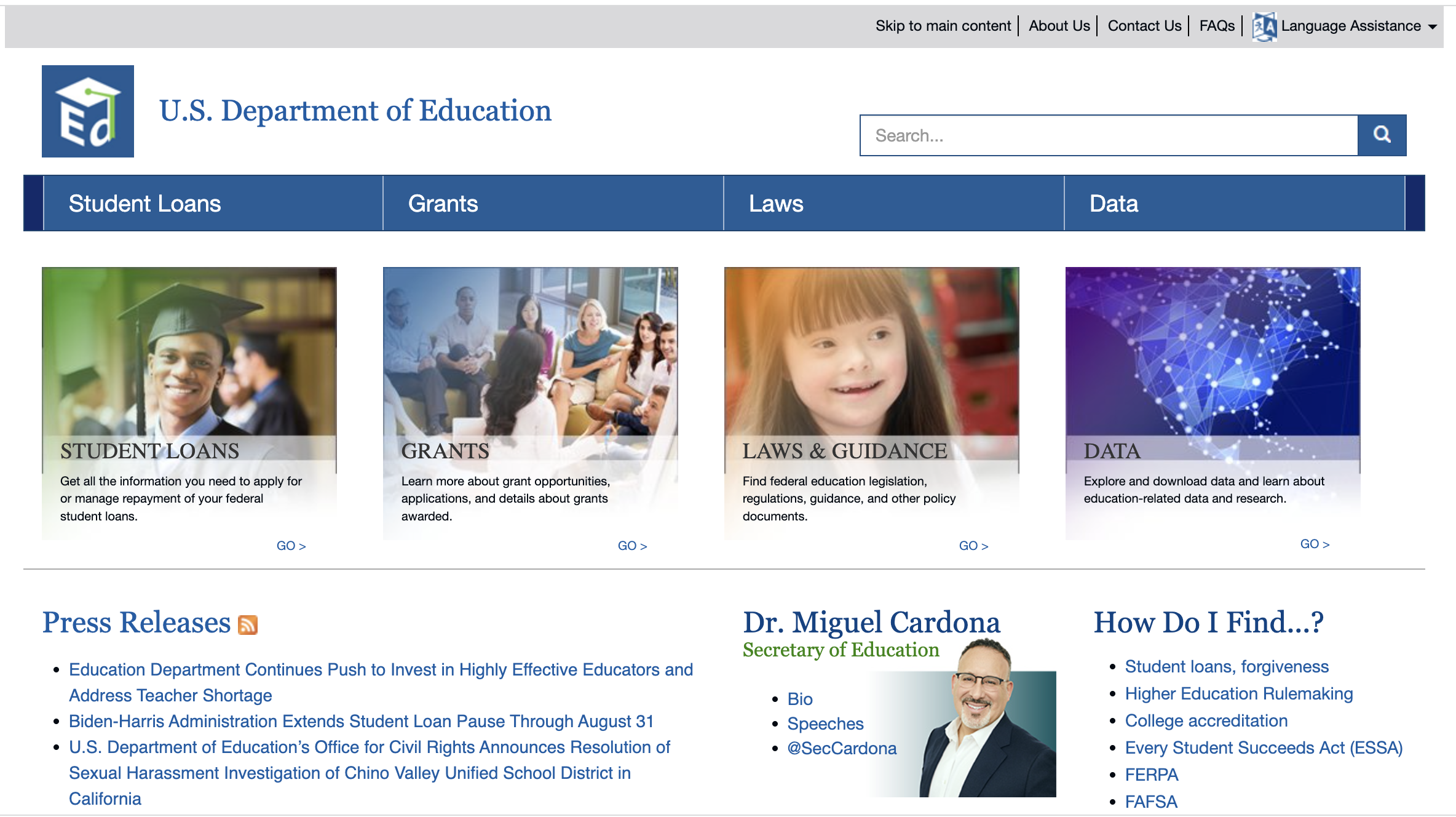
OLD HOMEPAGE
NEW HOMEPAGE
OLD MOBILE
NEW MOBILE
