Chicago Underwater Hockey Website Redesign

TIMELINE
3 Weeks
MY ROLE
Research, Wireframe, Prototype
TEAMAslie, Bea, Beth Ann
TOOLS
Figma, Figjam, InVision, Canva, PhotoShop
OVERVIEW
The Chicago Underwater Hockey is a non-profit organization that promotes inclusion and diversity in a healthy and social environment. Underwater hockey is a co-ed sport, with players aged 12 to 82. Because this sport is played in the water, it’s easy on the joints and helps keep people active and healthy. It’s also great for people to meet new friends and build relationships. The Chicago UWH team needs to acquire new members and increase member retention to keep this 62-year-old club alive. The goal of this website redesign is to bring awareness to the little-known sport and to encourage Chicago residents to give it a try. So, let’s dive in!
THE PROBLEM
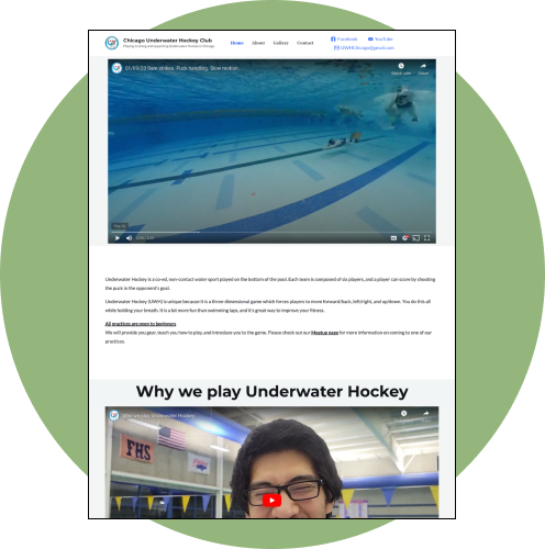
Users were disappointed with the limited amount of content on the website. They expected more in-depth information about the sport. They were also frustrated with a number of interface issues that made the website confusing and unusable.
THE SOLUTION
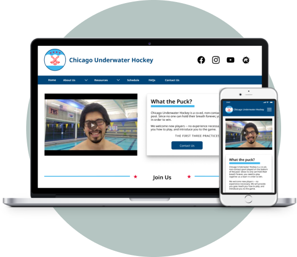
Expand the website content and redesigned the interface to encourage new members to sign up and provide a one-stop-shop with the resources and information that new and existing members need to accomplish their goals.

UNSERS’ NEEDS & EXPECTATIONS
Users expected to find: a calendar of events and practice schedule and locations, upcoming events, pricing, how to join and contact info, frequently asked questions, links to buy equipment, rules of the game and how to play, and more resources for beginners and advanced players
-
USER PERSONA
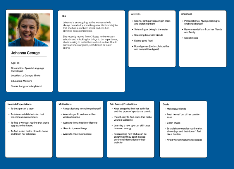
Developing an user persona allowed us to put ourselves in the users’ position and gain an empathetic understanding of their goals, needs and pain points.
-
STORY BOARD
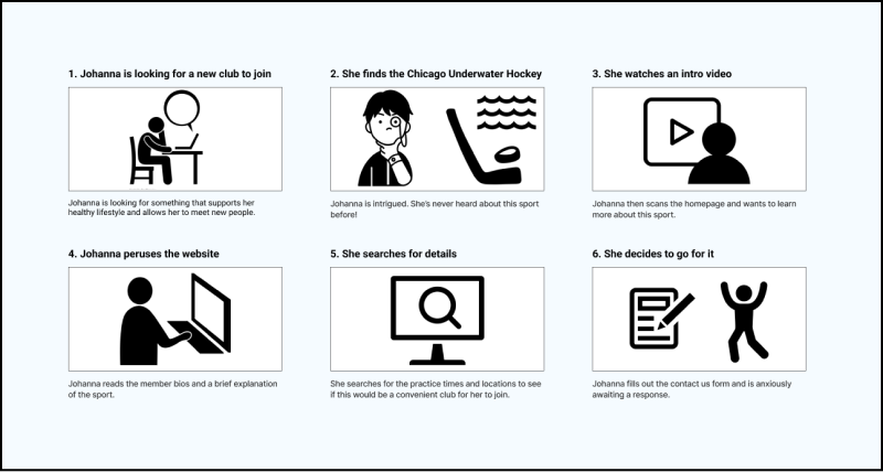
Understanding the steps the users need to take to perform their tasks helped us figure out what features are required to meet the users’ needs and how to prioritize our efforts.
-
USER INTERVIEWS
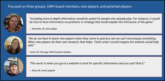
We discovered that users were disappointed with the limited information. The affinity diagram helped us identify they expected more in-depth info and resources, like a calendar, practice schedule, tournaments, pricing, FAQS, equipment, contact form, rules and how to play.
-
SURVEY DATA
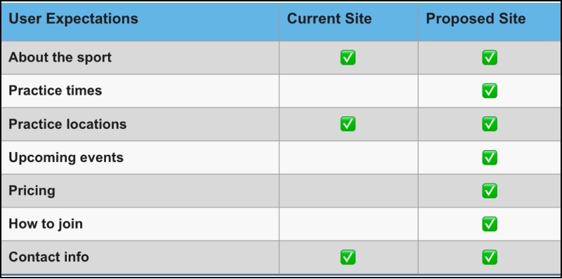
The main objective of the survey was to discover what users expected to find in a sports club website in general. The main expectations were: About the sport, practice times and locations, upcoming events, pricing and how to join.

DEFINING THE PROBLEM
New and prospective club members interested in underwater hockey got discouraged by the website’s lack of relevant information and inefficiency, which forced them to visit multiple online platforms to learn more about the sport and complete the sign-up process. The website presented heuristics and design principle issues like a cluttered header, a small and confusing logo, intrusive and oversized videos, inconsistent and misguided design, and links.
-
HEAURISTICS EVALUATION
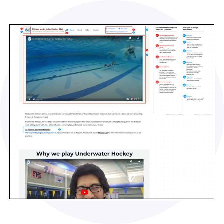
The user interface issues included a cluttered header with inconsistent fonts, a small and not identifiable logo. The homepage video was intrusive, it auto-plays (with sound) and covers most of the screen above the fold, taking up a lot of prime real state and preventing other relevant information to be shown.
-
HIGHLIGHTED PROBLEMS
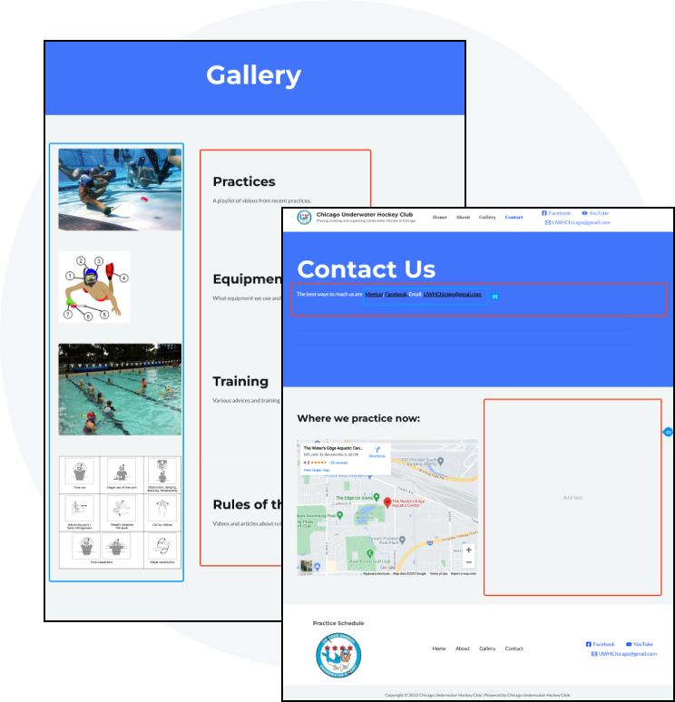
“Practice Schedule” on the footer is not linked. Inconsistent and misguided links. The footer logo takes you to the Meetup website. "Gallery” headline is misleading, the links are not differentiated with color- unclear that those links take you to YouTube. The Contact Us page has an inconsistent design, the condensed copy is hard to read and does not pass color contrast guidelines.

IDEATION PHASE
Provided one centralized resource hub so new members will have a more pleasant experience and feel more motivated to sign up, more confident and prepared before their first practice, and ready to relax and enjoy the health and social benefits of the sport.
-
PRIORITIZATION MATRIX
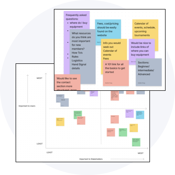
The interview data was organized and sorted into a prioritization matrix that allowed us to brainstorm a solution based on what was more important for our user and stakeholders. This information helped us understand where to focus our efforts.
-
CARD SORTING AND SITEMAP
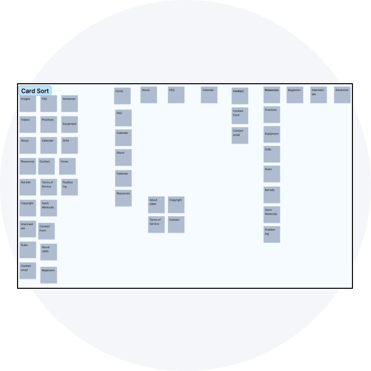
The main objective of the card sorting was to organize the new and expanded website content and define a proper information architecture. We organized, categorized and renamed the primary and secondary pages as well as the footer pages using LATCH. We also incorporated dropdown menus to effectively arrange the content structure
INITIAL UI IMPROVEMENTS PROPOSAL
Redesign the header and navigation system, increase logo size or possibly redesign, remove social media words from the header, keep only the icons, add Instagram, reduce overall video size, and eliminate autoplay
Add 101 guide or FAQs Section, and add resources for beginners, intermediate and advanced players. Updated images and videos, and re-purpose and create new content.
Add equipment resources and links, a form for questions to the contact page, a section for practice cancellation and rescheduling, and a calendar for events, games, tournaments, testimonials, and reviews.
-
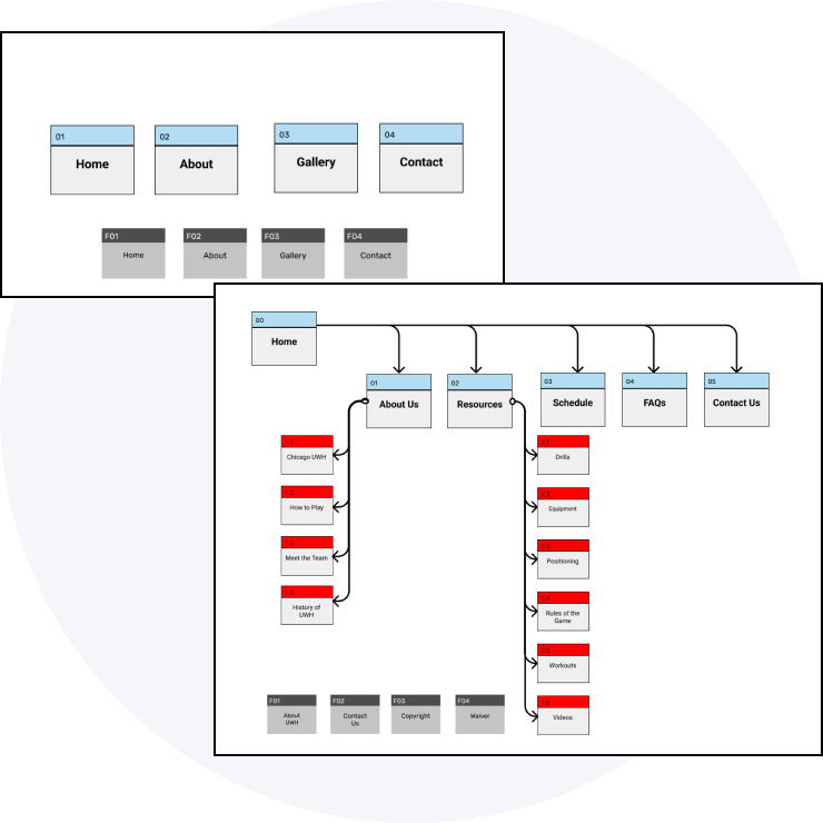
NEW SITEMAP FROM 4 TO 18 WEB PAGES
-
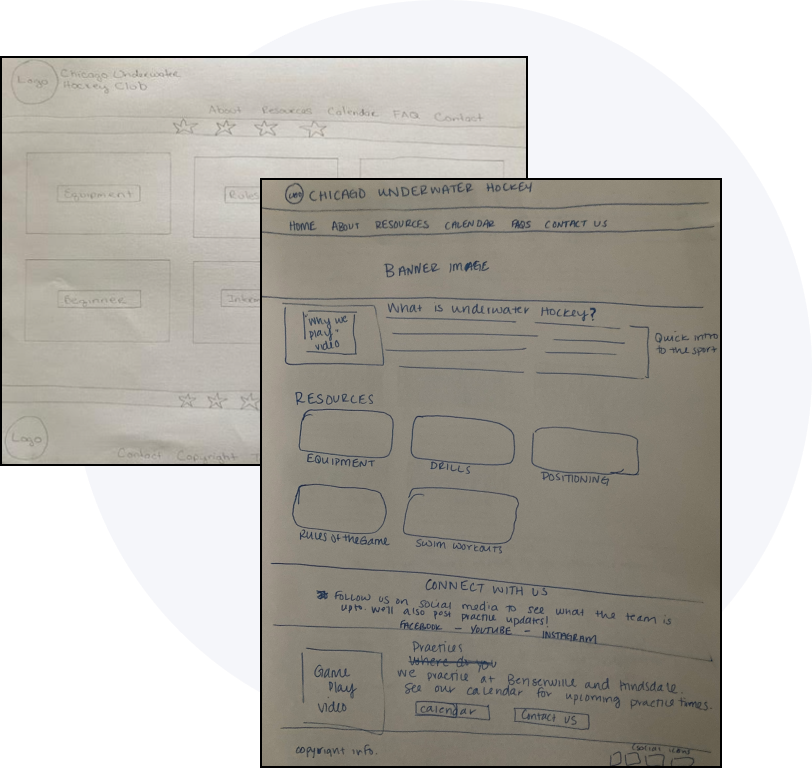
PAPER SKETCHES FOR POSSIBLE SOLUTIONS
-
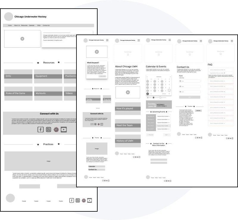
RESPONSIVE WIREFRAMES & LOW- FIDELITY PROTOTYPE

PROTOTYPE
Branding and Style Guide Applied to
High-Fidelity Responsive Clickable Prototype
-
NEW LOGO AND BRANDING INSPIRATION
We incorporated the Chicago flag colors and elements in the logo and interface design.

-
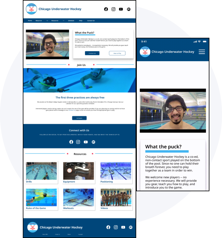
HIGH-FIDELITY PROTOTYPE
We used original club and players images, repurposed some elements like videos and other content, and kept the branding elements consistent throughout the website.
DIVE INTO IT!

TESTING & ITERATING
-
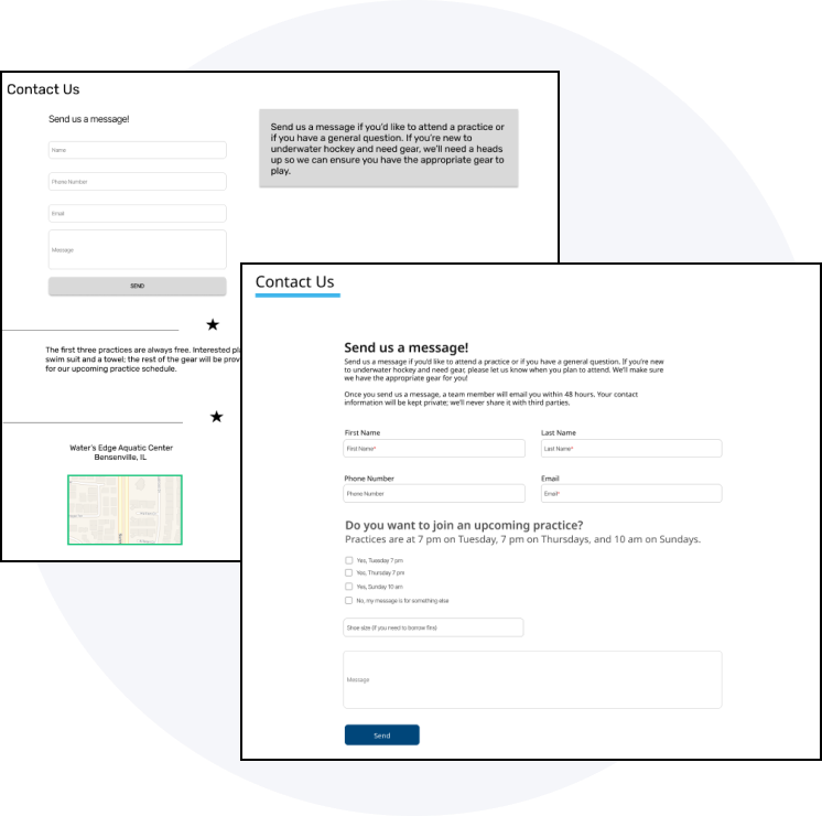
ITERATIONS AFTER USABILITY TESTING ROUND #1
A section that asks people which practice they want to attend in the contact form, waiver to the footer, ages-who can play, return to top on mobile, removed practice info from the contact us page.
-
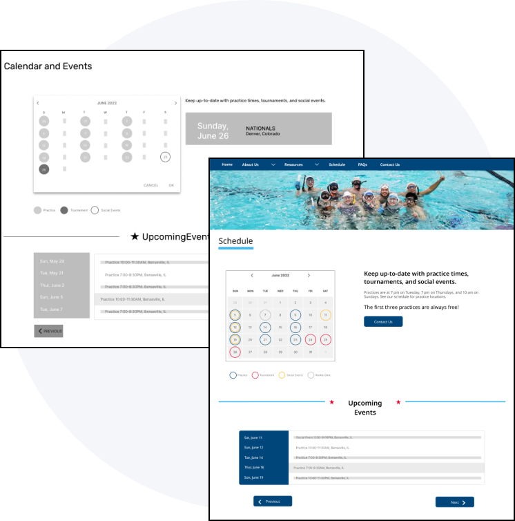
ITERATIONS AFTER USABILITY TESTING ROUND #2
Changed Calendar to Schedule on the Navigation menu and page tittle. Users were confused and couldn’t complete the usability testing task. Incorporated color-coded calendar/events.
FEEDBACK & COMMENTS FROM TESTING ROUND #3
“Homepage - connect with us, assumed it was the footer. Never went further than that. Preferred having the practice information higher up. But maybe naming it something different like "New players". Liked What the Puck. Maybe include a secondary button for how to play. Schedule page - easy to understand. Maybe include another section for rookie clinics (new player clinics). About us -- how is it ordered? should it be alphabetical? Didn't immediately know that the videos were scrolled. Why are some of the pages taking us to the center of the page?”
— Calvin
“Concerned about contact us page -”If I sign up, will you spam me with a ton of emails? Will my email be shared with UWH equipment vendors?” Maybe include a sub-header under What the Puck. Too much copy right now. He wouldn't read it. Wants to click on the videos. Stopped at Connect with Us. Assumed it was the footer. Reorder About Us dropdown. Move How to Play to the top. Once he sends a contact message, he'd be done with the site. No need to look elsewhere. Want a "next" button to tell him where to go next. Maybe include a section on the homepage that says "Are you new? Start here. Then it walks them through the basics of the site/sport.?”
— Mike
Liked the white space at the top. Was surprised initially but she likes that it looks cleaner. Maybe could include social icons up there. Would expect a join us or sign up button. The Chicago title isn't centered. Prefer having practice information up higher. Stopped at Connect with Us -- assumed it was the footer. Recommended to rename Resources. Ambiguous right now. I like the color scheme and that it's consistent. Resource links aren't clickable in the dropdown (desktop).
— Laura Anne
HOMEPAGE ITERATIONS
Added Are you new here? section in place of the Connect with Us section. Some users were confused with this area, they thought it was the footer and didn’t scrolled passed this area.

MORE ITERATIONS
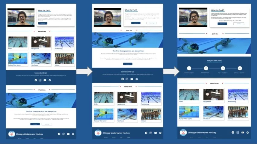
Changed connect with us on the homepage to the “New Here” section. Removed the “UWH Resources link/page. Made sure all dropdown links were clickable. Moved practice information higher up on the homepage. Resources moved to the bottom. Added secondary button on What the Puck section -- “How to Play”. Included “Rookie Clinic” as another item on the calendar. Added a play icon to all videos. Added a new line of copy on the contact us page to make it clear you won’t be spammed or added to a listing service.
Less copy in the What the Puck section. Centered Chicago title in the header. Added equipment card missing copy. Contact Form titles - Name/email/etc - added above the boxes, not just inside them. UPDATED links that take you to a new page, make them instant instead of smart prototypes. Made sure buttons went through the different states (default, active, hover. Included social links at the top of the page. Reordered about us dropdown.
FUTURE STEPS & ITERATIONS
Figure out a solution to make it clear that the sections are scrollable.
Add Resources Dropdown.
Rename Resources in the header and on the homepage. Not super clear what The Term encompasses
